The employee productivity metrics and KPIs worth tracking in 2026 fall into five groups: output and quality, time and focus, collaboration, manager support, and AI use.
Good examples are task completion rate, total focus time, meeting load, one-on-one frequency, and AI tool adoption.
Pick three to five, write down your starting numbers, and review them every month. Measure how well work gets done and how it moves between people, not how many hours someone is online.
Ask ten managers how they measure productivity and you will hear ten different answers. Some count hours. Some count tasks. Some go by gut feeling. That gap is why so many productivity programs stall: nobody agrees on what a good number looks like.
This guide lists 14 employee productivity metrics and KPIs for 2026. For each one, you get what it shows, how to calculate it, and what to watch for. It also covers how productivity measurement has changed over the past century and what AI changed in 2026. Where the Worklytics dashboard tracks a metric, you will see an example from its reports.
Worklytics makes workplace analytics software, so it is not a neutral party here. To keep this guide fair, it says which metrics Worklytics measures and which it does not. Each Worklytics metric named below is defined in the public Worklytics documentation.
What are employee productivity metrics?
Employee productivity metrics are numbers that show how much useful work people get done and how well that work moves through a team.
They answer questions like these.
Are people finishing what they plan to?
Do they have enough uninterrupted time to think?
Is anyone stuck, overloaded, or left out?
Productivity, efficiency, and performance: what is the difference?
Productivity: how much valuable work gets done compared with the time and effort put in.
Efficiency: doing the same work with less time, cost, or effort.
Performance: how well a person does their job overall, including quality, teamwork, and results.
A person can be efficient and still not productive. Someone who answers every email within minutes may never finish the project that matters. Good measurement looks at all three.
The basic formula
The classic formula is productivity = output divided by input. Output is the work produced, such as tasks finished or projects delivered. Input is the time, money, or people it took. If five people finish 40 tasks in a week, that is eight tasks per person. The formula works well when work is countable. For knowledge work, where one hard problem can take days, it leaves gaps. That is why most teams pair it with measures of focus, collaboration, and quality, covered below.
How employee productivity metrics have changed over time
The way companies measure productivity has changed with the kind of work people do. Each shift added new numbers and left some old ones behind.
From output counts to goals
In 1911, Frederick Taylor published The Principles of Scientific Management, arguing that studying each task and cutting wasted movement would raise output. Output per hour became a standard measure, and it suited work you could count, such as units built or tickets closed.
In 1954, Peter Drucker popularized management by objectives: managers and employees agree on goals and judge work by results instead of hours. In the 1970s, Andy Grove built on that idea at Intel and added measurable key results. John Doerr, who learned the method at Intel, introduced it to Google's founders in 1999, and it became known as OKRs (objectives and key results). Many companies still track goals this way.
Why knowledge work broke the old approach
Peter Drucker's 1959 book The Landmarks of Tomorrow is the source of the term "knowledge worker". Over the following decades, more and more jobs became knowledge work: writing, analysis, planning, design, code, and decisions. That kind of output is hard to count, so hours logged and emails sent became weak stand-ins for real work.
In 2020, a large share of office work moved online almost overnight, and managers could no longer see who was at a desk. The tools people used every day, such as calendars, email, chat, and video calls, kept a record of when work happened and who worked with whom. Measurement shifted from counting hours to looking at patterns: how much time people had to focus, how many meetings filled the week, and how connected teams were.
What AI changed in Productivity 2026
AI tools are now part of daily work for many teams. They changed measurement in four ways.
Individual speed went up, so speed alone says less. A task that took half a day, like drafting a document or fixing a bug, can now take minutes. Counting tasks finished says less on its own, because the effort behind each task varies more than before.
The bottleneck moved. Worklytics argues in its March 2026 post on the AI productivity paradox that AI speeds up individuals, but work still passes through reviews, approvals, and decisions made by people, so one person's extra output piles up for the next. Teams now measure where work waits as well as how fast it starts. In the data from that post, executives who do not use AI average about 1.93 hours of fragmented time a day (time in stretches too short to count as focus time), and heavy AI users cut that by 13%.
New things to measure appeared. Leaders now want to know who uses AI tools, how often, for which tasks, and whether it helps. That means tracking adoption (who uses it), proficiency (how much work it helps with), and results (is the work better or faster).
Measuring AI's effect got harder. In 2025, the research group METR ran a randomized study in which 16 experienced open-source developers were randomly assigned tasks to do with or without AI tools. Tasks took 19% longer with AI, yet the developers believed it had sped them up by about 20%. That was a small study of software developers, so it may not apply to other kinds of work. In February 2026, METR said its follow-up study gave an unreliable result, partly because many developers no longer wanted to work without AI, so it could not build a fair comparison. METR thinks developers are likely more sped up now than in 2025, but says its data is only weak evidence of how much. The lesson: people's own sense of their speed can be off, and you can no longer compare people using AI with people who are not, so track patterns over time.
Where measurement is heading
Measurement is moving from how fast each person works to how well work moves through the whole team, with more attention on review load, handoffs, and uneven AI use. The basics still hold: pick a few measures tied to real goals and check them on a schedule.
Employee productivity metrics and KPIs at a glance
Use this table to scan all 14. The last column shows where the data comes from. The first three come from project and goal tools. The rest come from the tools people use to work together.
Metric
How to measure it
Data comes from
1. Task completion rate
Tasks finished on time divided by tasks planned
Project tool (Asana, Jira, GitHub)
2. Work quality (error rate)
Tasks that needed rework divided by tasks finished
Reopened tasks, code review records
3. Goal attainment
Goals met divided by goals set
Goal or OKR tool
4. Workday intensity
Active hours divided by the span from first to last activity
Calendar, email, chat
5. Total focus time
Hours a day in uninterrupted blocks
Calendar, email, chat
6. After-hours work
After-hours messages and meetings, weekend hours
Calendar, chat
7. Meeting load
Meeting hours a week and share of time spent collaborating
Calendar, video calls, chat
8. Response time
Average time to reply to a direct message
Chat (Slack, Teams)
9. Breadth of collaboration
Unique collaborators per person per week
Email, calendar, chat
10. Isolation
Share of people with fewer than three collaborators in a week
Email, calendar, chat
11. One-on-one frequency
Share of people with a scheduled 1:1 in the past four weeks
Calendar
12. Manager effectiveness
Combine 1:1 frequency, manager meeting attendance, focus time, and survey results
Calendar, email, chat, survey
13. AI tool adoption
Share of people actively using AI tools, by team and role
AI tool usage data
14. Productivity ramp up
Weeks until a new hire's work pattern matches their peers
Calendar, email, chat, HR data
14 employee productivity metrics and KPIs to track in 2026
The first three metrics come from your project and goal tools. The other eleven can be measured from calendars, email, chat, and video calls. That data shows when work happens and who is involved. It does not include what people write or say.
Output and quality
These three show whether work gets finished, and finished well. Worklytics can report task completion and rework signals from project and code tools you connect, such as Asana, Jira, and GitHub. Goal attainment comes from your goal tool. Revenue per employee and customer satisfaction also belong here, but they come from finance and support systems, not from Worklytics.
1. Task completion rate
What it shows: how much of the planned work gets finished on time.
How to calculate it: tasks finished on time divided by tasks planned, times 100. With Asana connected, Worklytics counts tasks completed on time and tasks completed past their due date. With Jira, it counts issues completed.
What to watch for: a low rate can point to too much work, unclear priorities, or work stuck waiting on others. A rate near 100% every week can mean goals are set too low. Compare a team with its own past weeks, not with teams that do different work.
2. Work quality (error rate)
What it shows: how much finished work has to be redone.
How to calculate it: tasks that needed rework divided by tasks finished, times 100. For code, count bugs found after release. In Worklytics, reopened tasks (Asana), reopened issues and pull requests (GitHub), and pull reviews that ask for changes (GitHub) work as rework signals.
What to watch for: speed and quality pull against each other, so track them together, especially with AI tools that make extra drafts easy.
3. Goal attainment
What it shows: progress toward goals the team agreed on, such as OKRs.
How to calculate it: goals met divided by goals set, times 100. For goals with a target number, use the actual result divided by the target. The public Worklytics metric list has no goal or OKR metrics, so pull this from your goal tool.
What to watch for: if every goal is met, the goals were probably too easy. Set some that stretch the team, and expect to miss a few.
Time and focus
4. Workday intensity
What it shows: how much of the workday is spent on active work. Workday span is the time between a person's first and last activity of the day in digital tools.
How to calculate it: active digital work hours divided by workday span.
What to watch for: a long span with low intensity often means work is spread thin across the day. Very high intensity for weeks in a row can signal overload. Use it to spot team patterns, not to rank people. Worklytics reports workday span and includes it in its benchmark comparison, shown later in this guide.
5. Total focus time
What it shows: how many hours a day people get in long blocks with no meetings, email, or chat.
How to calculate it: the average hours per day in blocks of at least two hours with no meetings, email, or chat. Worklytics recommends the two-hour block for most knowledge workers and offers shorter-block versions for other kinds of work. Pick one length and keep it the same so the numbers stay comparable. Worklytics also reports fragmented time, which is time in stretches too short to count as focus time.
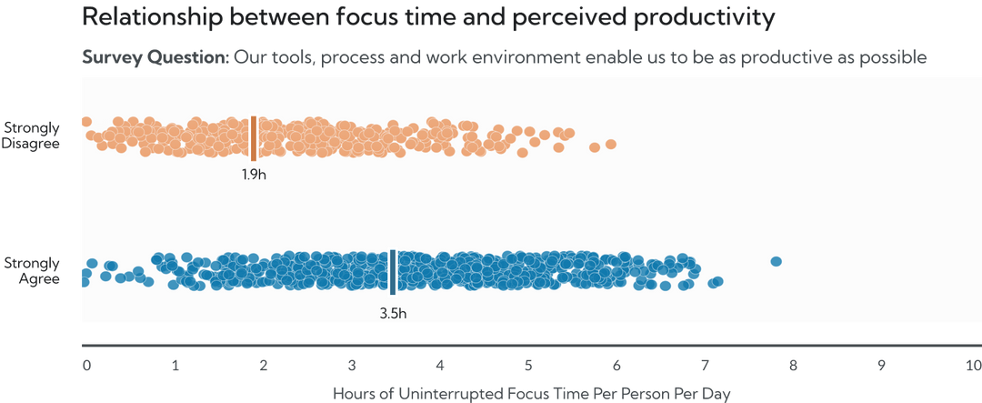
What to watch for: focus time tends to go together with feeling productive. In the Worklytics sample report below, people who strongly agreed that their tools and work environment let them be as productive as possible averaged 3.5 hours of uninterrupted focus a day. People who strongly disagreed averaged 1.9 hours. That shows a link, not proof of cause. For tips, see the guide to focus time in Outlook.
Sample report: people who feel most productive average 3.5 hours of uninterrupted focus time a day, compared with 1.9 hours for those who feel least productive.
6. After-hours work
What it shows: whether people work outside normal hours often enough to risk burnout.
How to calculate it: track after-hours messages and meetings, weekend hours, and days longer than nine hours, grouped by team.
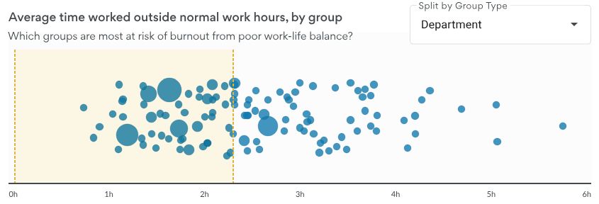
What to watch for: one late night means little. Look for teams where after-hours work stays high for weeks. Worklytics groups these signals by department to show which groups are most at risk. See also preventing burnout by analyzing collaboration overload.
Illustrative example: average time worked outside normal work hours, by group.
Collaboration
7. Meeting load and collaboration time
What it shows: how much of the working week goes to meetings and other collaboration compared with individual work.
How to calculate it: meeting hours per week, plus the share of working time that is collaborative versus individual work. Worklytics reports both.
What to watch for: when Worklytics measures focus time, meetings, chat, and email all count as interruptions, so a heavy meeting week leaves fewer long blocks. See also 12 metrics for effective meetings.
8. Response time
What it shows: how quickly people answer direct messages in Slack or Teams.
How to calculate it: the average time to reply to a direct message, plus the share of new conversations that get a reply within 12 hours. Worklytics measures both.
What to watch for: slow replies can stall work, but answering instantly all day cuts into focus time. Worklytics measures this for direct messages only, so it does not cover email. Aim for a reply window that fits the work.
9. Breadth of collaboration
What it shows: how many different people someone works with in a week, and whether teams connect across departments.
How to calculate it: the number of unique collaborators per person per week. A collaborator is anyone you interacted with by email or in a meeting, even briefly. Worklytics also counts strong collaborators (people you spent at least two hours with that week) and the share of collaboration time spent with people outside your own team.
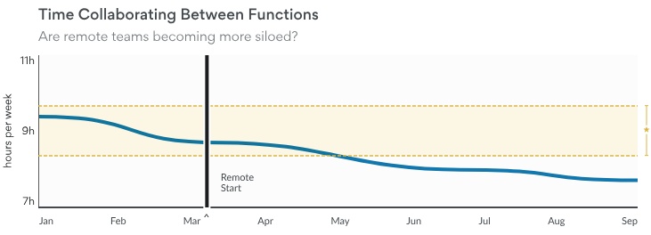
What to watch for: a drop after a change such as a move to remote work. In the sample below, time spent collaborating between functions fell after remote work began.
Sample report: hours per week spent collaborating between functions, before and after remote work began.
10. Isolation
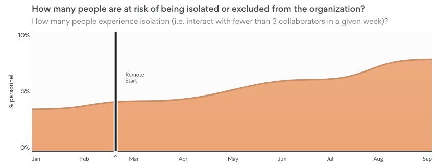
What it shows: how many people are at risk of being left out.
What to watch for: check new hires and remote workers first. In the example below, the share of isolated people rose from about 4% when remote work began to almost 8% by September.
Sample report: share of people who interact with fewer than three collaborators in a week, before and after remote work began.
Manager and team
11. One-on-one frequency
What it shows: how often employees meet one-on-one with their manager.
How to calculate it: the share of employees who had a scheduled 1:1 with their manager in the past four weeks.
What to watch for: teams where more than a month passes between 1:1s. Worklytics also reports the number of weeks since each person's last 1:1.
12. Manager effectiveness
What it shows: how well managers support their teams.
How to calculate it: there is no single formula. Worklytics documents several manager signals: how often an employee has a 1:1 with their manager, how many of their meetings the manager also attends, weeks since the last 1:1, and how much of the collaboration the manager starts. Teams often add team focus time, meeting load, and survey results on manager support.
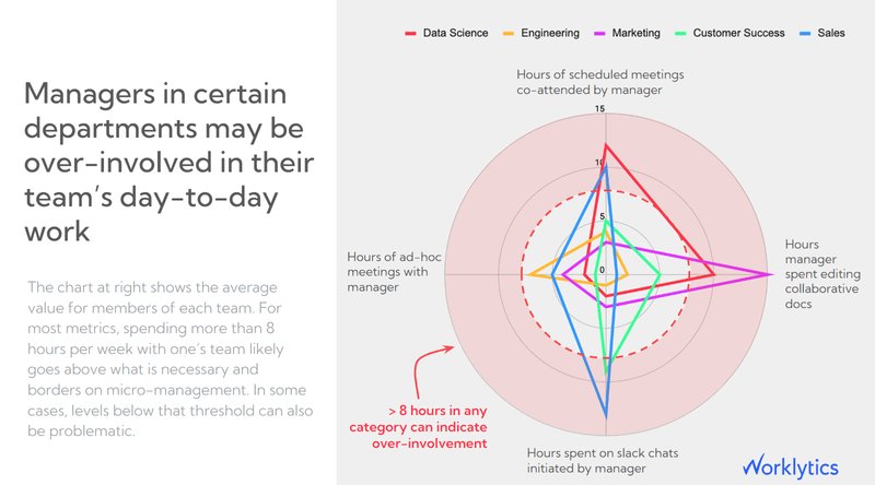
What to watch for: compare managers with similar team sizes and roles, and use the results to coach, not to punish. Managers can also be too involved: the Worklytics sample report below flags more than 8 hours a week in any one category (co-attended meetings, ad hoc meetings, shared documents, or chats) as a sign of over-involvement. For more, read about the manager effectiveness metrics that matter more than survey scores.
Sample report: average weekly hours managers spend in their team's meetings, ad hoc meetings, shared documents, and chats, by department.
Growth and technology
13. AI tool adoption
What it shows: how many people use AI tools and how deeply.
How to calculate it: the share of employees actively using AI tools in a month, split by team and role. Then track depth: how often people use the tools and for what kind of work. Worklytics reports the number of days someone used AI and how many times, across all tools and by tool type, such as chat apps, coding tools, and AI built into existing software.
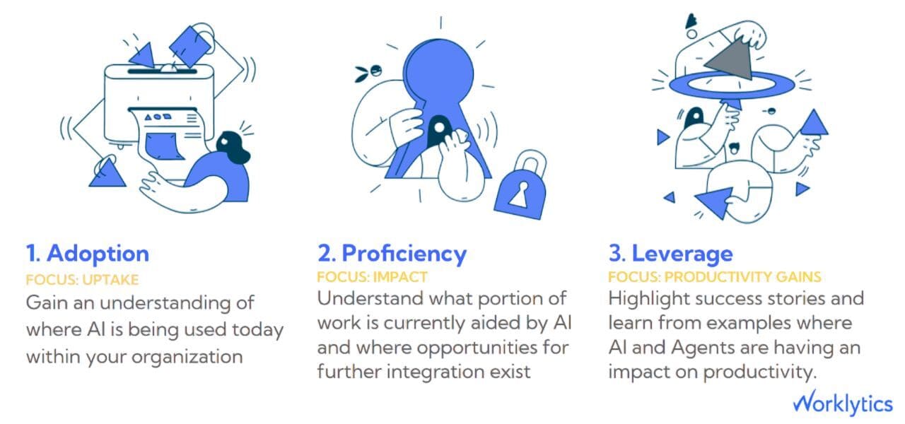
What to watch for: uneven adoption between teams creates friction at handoffs. Worklytics uses a three-stage model: adoption (where AI is used), proficiency (how much work it helps with), and productivity gains (where it makes a real difference). For the full metric list, see which metrics matter when tracking employee AI adoption.
Worklytics AI maturity model: adoption, proficiency, and productivity gains.
14. Productivity ramp up
What it shows: how quickly a new hire's work settles into the pattern of their teammates.
How to calculate it: one way is to count the weeks until a new hire's activity (meetings, collaborators, focus time) matches the median for peers in the same role. Worklytics data includes tenure, which lets you compare new hires with longer-tenured teammates. It also counts strong collaborators (people someone spends at least two hours a week with), which you can track for new hires.
What to watch for: a slow ramp up often points to weak onboarding or a stretched manager.
Employee productivity metrics by role
Some jobs need their own measures on top of the 14 above. These are common starting points.
Cycle time (time from starting work to release), deployment frequency, defect escape rate (bugs found after release)
HR and people teams
Time to hire, new-hire ramp up, retention
How to track and report on productivity metrics
Where the data comes from
Most productivity numbers come from tools your team already uses: calendars, email, chat, video calls, project tools, and code repositories. Each one records when things happen, who was involved, and how long they lasted. A measurement platform pulls this together so you do not have to combine spreadsheets by hand.
Worklytics connects to more than 25 tools, including Slack, Microsoft 365, and Google Workspace, and turns the data into hundreds of metrics. It anonymizes the data before analysis and does not read the content of messages or documents. You can see the setup on the how it works page. Most Worklytics metrics are reported as weekly totals, so you can check whether a change is working after a few weeks instead of waiting for a quarterly review.
What to put in an employee productivity report
A useful report is short. Put these in this order:
Summary. Two or three sentences on what changed and why it matters.
KPI table. Each KPI with this period's number, last period's number, and the target or benchmark.
Team comparison. Which teams are outside the normal range, and in which direction.
Context. Anything that explains the numbers, such as a product launch or a holiday.
Actions. What you will change next, who owns it, and when you will check again.
Send managers a weekly view and leaders a monthly one. Report at the team level, not the individual level. For an example of a full report, see the sample meeting report.
Productivity metrics for hybrid and remote teams
Hybrid and remote work changes what the numbers look like, not which numbers matter. Watch four of the 14 more closely: total focus time, meeting load, isolation, and breadth of collaboration. As the sample in the breadth of collaboration section shows, time spent collaborating between functions can fall after remote work begins.
Also watch workday overlap, the hours teammates are online at the same time. Worklytics reports the average number of shared workday hours between a person and their teammates, and has added metrics for how time zones affect coordination. For more, see the posts on metrics for remote work effectiveness and 6 KPIs to make hybrid work a success.
Use information about the work, such as meeting times and message counts, and never the content.
Report at the team level and hide small groups so no one can be identified.
Tell employees what you measure, why, and how the results will be used.
Follow local rules such as GDPR and CCPA.
Worklytics anonymizes data at the source and reports results by group. That protects privacy, but it also means the data cannot tell you how good any one person's work is. Use it to find team-level patterns, then talk to people.
How to set and improve employee productivity KPIs
A long list of metrics rarely helps. The goal is a short set of numbers that leads to decisions.
Pick three to five KPIs
Start with the goal, then pick the numbers. If the goal is better focus, use total focus time and meeting load. If the goal is faster onboarding, use productivity ramp up and one-on-one frequency. Three to five KPIs per team is enough. With more, teams tend to stop checking them.
Set a baseline
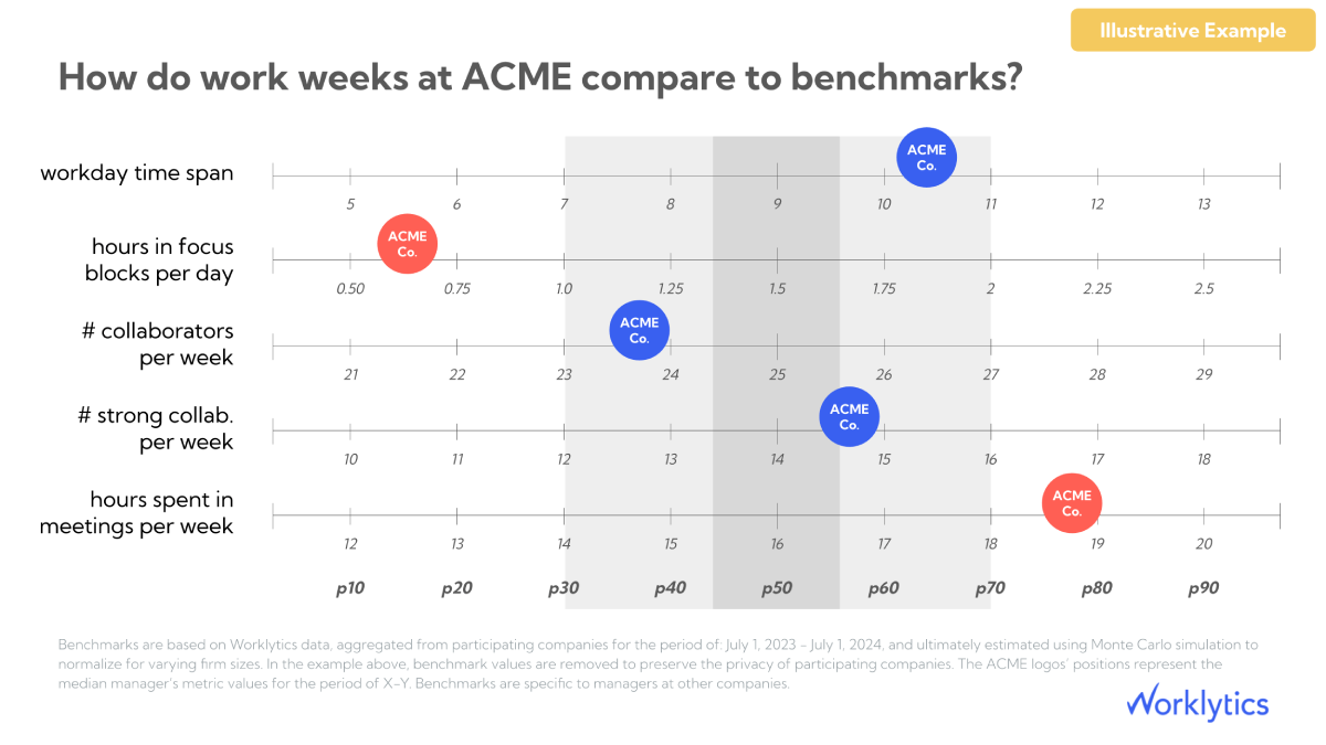
A baseline is your starting number. Measure each KPI for four to eight weeks before you change anything, so you know what normal looks like for each team. Then compare with similar companies. The Worklytics benchmarks show where a team sits against peers on workday span, focus time, collaborators, and meeting hours. Treat the normal range as a starting point, not a target, because normal does not always match best practice.
Illustrative example: where a company's work week sits compared with benchmarks for workday span, focus time, collaborators, and meeting hours.
Add measures that are not numbers
Numbers miss things. Add a few checks that people fill in: OKRs for goals, 360 feedback (input from managers, peers, and direct reports), and a short survey asking whether people feel productive. The gap between how work feels and what the data shows is often the most useful thing to look at.
Roll it out in three steps
Choose and define. Write down each KPI, its formula, and where the data comes from.
Measure and share. Collect the baseline, share results with employees, and explain what you track and why.
Review and adjust. Look at results every month, talk with managers about teams outside the normal range, and change one thing at a time. Drop any KPI that never leads to action.
Turn the numbers into action
Data only helps if it changes something. These fixes come up most often:
Protect focus time. Block calendar time for focus work and cut recurring meetings that no longer serve a purpose.
Batch messages and group meetings. Answering chat in batches and booking meetings back to back can open a long block of focus time without cutting meeting hours.
Use the numbers in 1:1s. Talk about what the data suggests and ask what is getting in the way.
Test one change at a time. Check the numbers a few weeks later to see whether it worked.
Sample report: grouping meetings and answering chat in batches opens a long block of focus time, even with the same four hours of meetings.
Mistakes to avoid
Tracking too many metrics. Pick a few and drop the rest.
Tracking without acting. If a number never leads to a decision, stop collecting it.
Reading numbers without context. A team in the middle of a product launch will look different from the same team a month later.
Choosing numbers that look good but do not tie to a goal. Emails sent and hours online are common examples.
Ranking individuals. Collaboration data is built to show team patterns, not to compare people.
Skipping manager training. Managers need to know how to use the numbers in a conversation, or the data goes unused.
Frequently asked questions
What are the most important employee productivity metrics?
The most useful ones cover five areas: output and quality (task completion rate), time and focus (total focus time), collaboration (meeting load), manager support (one-on-one frequency), and AI use (tool adoption). Pick three to five that match your goals.
How often should you review productivity KPIs?
Managers can check team numbers every week or two, and leaders monthly. Once a quarter, check whether each KPI still ties to a current goal and drop the ones that no longer lead to action.
What is a good benchmark for productivity KPIs?
It depends on the role and company, so start with your own baseline, then compare with similar companies. In Worklytics benchmark research from 2023, knowledge workers with at least 3.5 hours of daily focus time tended to report being more productive than those with less, but most companies had too little.
What is the difference between productivity and efficiency?
Productivity is how much valuable work gets done for the time and effort spent. Efficiency is doing the same work with less time, cost, or effort. A team can be efficient at low-value work and still not be productive.
Can employers legally monitor employee productivity?
Rules vary by country and state. In the EU, GDPR expects a lawful reason, openness with employees, and monitoring that fits the goal. Anonymous, team-level data about how work flows is generally easier to justify than screen recording or keystroke logging. This is general information, not legal advice, so check with your legal team first.
How has AI changed the way productivity is measured?
AI made individual tasks faster, so counting tasks says less than it used to. Teams now also track who uses AI tools and how deeply, where work waits for review, and whether quality holds up.
Where to start
Productivity measurement works when it stays small, ties to real goals, and helps teams instead of policing them. Start with three to five KPIs from the list above, write down your starting numbers, and review them every month.
If you want to see the collaboration metrics in this guide on your own data, the Worklytics productivity dashboard offers a free 30-day trial. It measures patterns in collaboration tools, so it will not tell you how good the work is or track tasks, quality, or revenue. Pair it with your project tools for those. You can also browse the full metric list in the Worklytics documentation.
Share this post
Request a demo
Schedule a demo with our team to learn how Worklytics can help your organization.