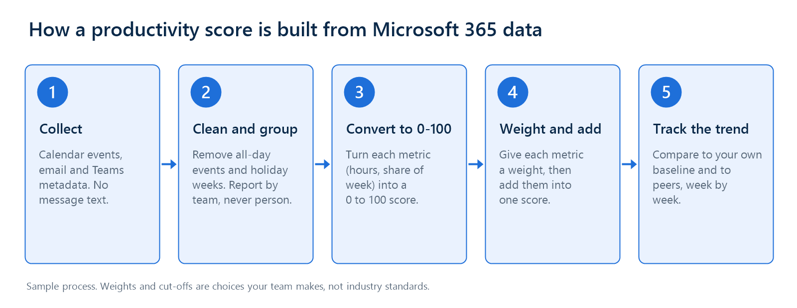
Short answer: An employee productivity score from Microsoft 365 data is a weighted 0 to 100 number built from work-pattern metrics such as meeting load, focus time, and workday length. Collect calendar, email, and Teams metadata, convert each metric to a 0 to 100 scale, weight the metrics, and report by team. Microsoft's own Adoption Score is different. It measures how an organization uses Microsoft 365 tools, not how productive people are.
Most guides on this topic stop at a list of metrics and a sample formula. The hard part is that a score is only as good as its definitions and cut-offs, and those are rarely stated. Two teams can run the same formula on the same Microsoft 365 tenant and get different scores because one counts overlapping meetings twice or measures focus time in longer blocks.
This guide is for IT and HR analytics teams. It shows what Microsoft's own score measures, the definitions that quietly change a score, the thresholds Worklytics has published for burnout and focus, and a scoring query built on them. The query was run on a synthetic test dataset, and the page says so wherever it uses those results. Worklytics sells workplace analytics software, so the guide also points out where a tool helps and where you can do the work yourself.
Many people who search for a Microsoft productivity score want the report inside the Microsoft 365 admin center. Microsoft launched it as Productivity Score in 2020 and replaced it with Adoption Score in 2022. Its purpose is to show how an organization uses Microsoft 365, not to rate individual employees. The name change followed a backlash: the 2020 version could show user names, and on December 1, 2020, Microsoft announced it would remove them and show only organization-level data. Anyone building their own score should take the same lesson about employee trust.
The report changed again in 2026. Starting January 22, 2026, Microsoft retired the Technology experiences part (network connectivity, Microsoft 365 Apps health, and endpoint analytics). The score now adds up five categories worth 100 points each, plus AI adoption if Copilot licenses are enabled, for a maximum of 600 points. It reflects the last 28 days and is calculated at the organization level, never for individuals. Older articles that list technology categories or other point totals describe earlier versions. To track Copilot use in more detail, see how to track Copilot utilization.
Adoption Score answers a technology question. A custom score answers a different one: do our teams work in a way that leaves room for focused work, avoids overload, and stays sustainable? It shows how time is used, not the quality or value of the work, so treat it as a signal that starts a conversation, not as a grade for a person.
The bigger risk sits upstream of the formula. The metrics you feed into it depend on definitions that differ between tools. This section uses Worklytics's public data documentation to show the choices that change a score.
Worklytics exports weekly aggregates as one row per person, week, and metric, with four fields: employeeId, week, key, and value. Groups such as team, level, and employment type sit in a second table. That long format is why a scoring query is a set of filtered sums grouped by team, and why the minimum group size can be enforced in the query itself.
Viva Insights has its own definitions. For example, uninterrupted hours are blocks of one hour or longer, while the main Worklytics focus time metric uses blocks of two hours or longer. Neither is wrong, but the numbers are not interchangeable. Choose one source of truth for the score, write the definitions down, and do not mix tools inside one score.
A score needs cut-offs: how many focus hours is good, how long a workday is too long. Instead of inventing them, this guide uses thresholds Worklytics has already published in two posts, a May 2022 post on burnout indicators and the October 2023 benchmarks post.
Read these as starting points. The posts do not publish sample sizes or how the thresholds were derived, and the focus threshold moved from 3 hours in 2022 to 3.5 hours in 2023. The benchmarks post also warns that a normal range is not always a good range: a company can sit at the median for focus time and still have too little of it. Check the thresholds against your own survey data before you rely on them, and write down which ones you used.
There are three common routes to Microsoft 365 collaboration data:
Set privacy rules before you extract anything. Always aggregate data so that no group is small enough to identify one person. Microsoft requires Viva Insights administrators to set the minimum group size to at least five, and many organizations choose a higher number, such as 10, for scores that leaders compare across teams. Pick one threshold, apply it everywhere, and write it down. This approach supports compliance with GDPR, CCPA, and other data protection laws, but the rules depend on your country and your data, so involve your legal team. The EU AI Act also lists AI systems used to monitor and evaluate the performance and behavior of workers among its high-risk uses, so ask legal whether your scoring tool falls under it.
True productivity covers efficiency, effectiveness, and sustainability. Microsoft 365 data covers some of that well and some of it not at all. The table shows which metrics this guide scores, where each one comes from in Viva Insights and in the Worklytics data dictionary, and what needs a second data source. For a wider list of metrics, see employee productivity metrics and KPIs.
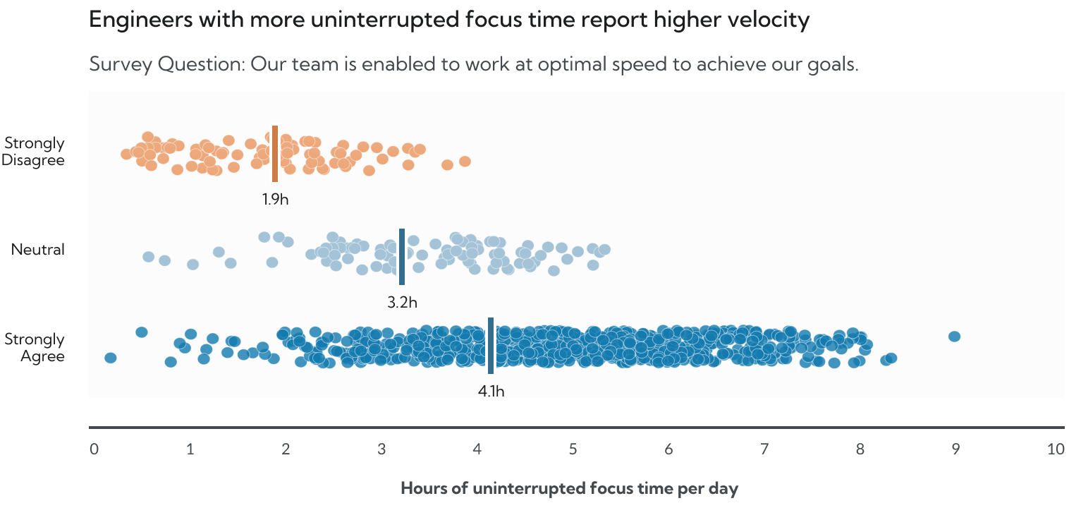
Focus time gets the largest weight in this guide's sample model, and there is published evidence behind that choice. Worklytics's research found that knowledge workers with at least 3.5 hours of daily focus time tend to report being more productive than those with less. A chart on Worklytics's Microsoft Teams analytics page shows the same pattern for engineers: those who strongly agreed that their team can work at optimal speed had a median of 4.1 hours of uninterrupted focus time a day, against 3.2 for neutral and 1.9 for those who strongly disagreed. The chart does not state its sample size or dates, so read it as illustrative evidence, not as a benchmark.
One block length does not fit every job, and the Worklytics methodology says so. It defines separate variants for different kinds of work:
Scoring a sales team and an engineering team on the same block length makes the sales team look worse for doing its job, so pick the variant by role and compare teams only against similar roles. The query in this guide uses the 2 hour variant. Worklytics also suggests, in a post on collaboration overload, a healthy baseline of two to three focus blocks of 60 minutes or more per day for knowledge roles, and says many teams show none. For more on what breaks focus up, see how distractions and interruptions affect focus time.

More collaboration is not better, and collaboration hours alone say little. A more useful signal is whether people have close working relationships. This guide's connection score is the share of person-weeks in which a person had five or more strong collaborators, the isolation threshold from the table above. It needs no arbitrary hour targets. Also watch the other end: Worklytics reports that 12 or more strong collaborators tends to go with higher burnout risk, so a team can be connected and still carry too much overhead. To see when collaboration turns into overload, read how to prevent burnout by analyzing collaboration overload.
Meeting load is meeting hours in a week divided by five times the weekday span, so a person with 10 meeting hours and a 9 hour span has a load of about 22%. Dividing by span instead of a flat 40 hours keeps long-day and short-day workers comparable. Which meeting hours you use matters, as the definitions table shows, so check whether your metric counts direct time or exclusive meeting time. Because no threshold has been published for meeting load, the score uses the benchmarks approach: the best value is the 25th percentile and the worst is the 75th percentile of meeting load across everyone in the scored data. Calendar metadata can also show meeting quality signals: Viva Insights reports hours in large and long meetings, recurring meeting hours, meetings that end on time, conflicting meetings, and meetings scheduled with six hours or less of notice. To see how these work in practice, read how meeting insights reduce meeting overload.
Hours and percentages cannot be added together until they share a scale. This guide uses two methods. For continuous metrics, score linearly between a best and a worst value: for a metric where lower is better, such as meeting load, the score is (worst value minus your value) divided by (worst value minus best value), times 100. For a metric where higher is better, such as focus time, the score is (your value minus worst value) divided by (best value minus worst value), times 100. Keep every score between 0 and 100. For metrics with a bright line, such as a 9 hour day, score the share of person-weeks that stay on the right side of it.
The weights are a sample starting point, not an industry standard. They add up to 90, and the query divides by the total so the score still runs from 0 to 100. If you have an outcome measure from your own systems, such as on-time delivery, add it as a fifth component, because Microsoft 365 data does not measure output quality. Agree on the weights with managers and employee representatives, change them only at set times such as once a quarter, and record every change so that trends stay comparable. The next section shows how much the weights matter.
The query below computes team scores from Worklytics weekly aggregates using the real metric keys. It applies the active and 4 hour filters from Worklytics's sample SQL, flags each person-week against the two burnout thresholds, finds the meeting load range from your own data, drops groups under the minimum size, scores each component, applies the weights, and re-scores under shifted weights to test whether the ranking holds. It is written in BigQuery-style SQL, like Worklytics's own samples, and every threshold and weight sits in one params block.
The test dataset is synthetic. A script generated 57 people in six teams over eight weeks, with one part-timer per team and a few random inactive weeks. It is not Worklytics customer data, and the scores say nothing about real teams. Its purpose is to show that the query runs, that the filters work, and how to read the output. The four-person Legal team does not appear in the results because it falls under the minimum group size, and the part-timers are excluded.
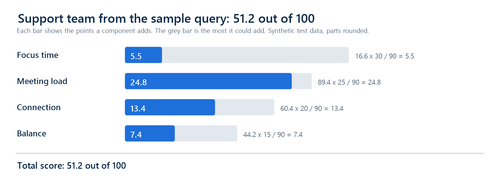
Take the Support team. Its people averaged 0.999 focus hours a day, which scores (0.999 minus 0.5) divided by (3.5 minus 0.5), times 100, or 16.6. Its meetings take 21.2% of the workweek. In this data the meeting load range runs from 20.3% (best) to 28.74% (worst), so the score is (28.74 minus 21.2) divided by (28.74 minus 20.3), times 100, or about 89. Sixty percent of its person-weeks had five or more strong collaborators, a connection score of 60.4, and 44% stayed within the 9 hour and 2 hour limits, a balance score of 44.2. With weights of 30, 25, 20, and 15, the score is (30 times 16.6 plus 25 times 89.4 plus 20 times 60.4 plus 15 times 44.2) divided by 90, or 51.2. The query output rounds these numbers, so a hand calculation can differ by a tenth of a point.
The weight-shift test is the useful part. It re-scores every team with 5 points of weight moved between focus and meetings, or between connection and meetings, and shows the rank each time.
Three things stand out. First, Engineering stays first and Sales stays last under every weight setting, so those two placements are safe to report. Second, the three teams in the middle (Finance 53.7, Support 51.2, Marketing 49.7) sit within 4 points of each other and change places. Support drops to fourth when focus gains weight, because it has the weakest focus score of the three, and rises to second when focus loses weight, because it has the strongest meeting score of the three. Third, the meeting range is narrow. The middle 50% of person-weeks spans only about 8 points of the workweek, so Support at 21.2% scores 89 while Marketing at 26.0% scores 32. A gap of under 5 points in meeting time became a gap of 57 points in the score. If your own range is this tight, widen it (for example, use the 10th and 90th percentiles) or score meetings against a target, and rerun the weight test.
The practical rule is to report teams in bands, such as top, middle, and bottom, and to save exact numbers for trends within one team. Here that would put Engineering on top, Sales at the bottom, and the other three together in the middle.
A bare number invites arguments. Worklytics's Flexible Work Scorecard shows one way to present a score: each measure gets a letter grade and a rank against peers. Build separate views for separate readers, starting from Microsoft's Ways of working Power BI report if you use Viva Insights. Leaders see score trends and department comparisons in bands. Managers see their own team's components. Individuals see personal insights, private to them, and never a ranking or a peer comparison. For tool options, see best employee productivity dashboards, or see how the workplace insights dashboard presents these metrics from several Microsoft 365 sources.

Twelve weeks is a planning estimate, not a benchmark.
The scoring method works the same way with Google Workspace data. Only the data source changes: Google Calendar, Gmail metadata, Drive activity, and Google Meet take the place of Outlook, Exchange, SharePoint, and Teams. Google lets administrators export Workspace logs for Calendar, Gmail, Drive, Meet, and other services to BigQuery, where you can calculate the same metrics. The export is limited to certain editions, such as Enterprise Standard and Plus and Education Standard and Plus, so check your edition first. For setup details, see the Worklytics pages on Google Workspace analytics, Google Calendar analytics, and Google Meet analytics.
Most scoring projects fail on definitions and interpretation, not on math. These are the problems to check first:
There is no published standard for how fast results appear. Judge the program by whether managers use the numbers and whether focus time and meeting load move against each team's own baseline over several months.
A productivity score from Microsoft 365 data is only as good as its definitions and cut-offs. Decide what counts as active, as a meeting, and as focus time, use published thresholds where they exist and your own data where they do not, and test whether the ranking survives a change in weights. Balance analytical rigor with privacy protection, so that measurement supports employees rather than simply monitoring them. Start small: pick a few metrics, set a baseline, report by team, and adjust as you learn.
Worklytics provides a privacy-first alternative to manual models, connecting to Microsoft 365 data while keeping message content out of scope. See how the Microsoft 365 integration works, or use this guide to build the score yourself first.
Microsoft's Productivity Score is now called Adoption Score in the Microsoft 365 admin center. It measures how an organization uses Microsoft 365, not how productive individual employees are.
No. Microsoft says Adoption Score insights are calculated at the organization level, and no one in an organization can use it to see how an individual uses Microsoft 365. Viva Insights shows managers team-level insights and requires a minimum group size of at least five.
There is no universal number for a custom score, because weights and cut-offs are your own choices. Compare each team with its own baseline and with similar teams, and avoid ranking teams that are only a few points apart. For Adoption Score, Microsoft says many mature organizations operate effectively at 80 to 90 points per category, so a perfect score is not the goal.
Worklytics has published 3.5 hours of daily focus time, a workday of no more than 9 hours, weekend work of no more than 2 hours, and at least 5 strong collaborators as useful lines. Treat them as starting points, because the posts do not publish sample sizes. Check them against your own survey data and write down which ones you used.
Use the weekly aggregates export, which has one row per person, week, and metric. Filter to active people, flag each person-week against the workday and weekend thresholds, score focus time, meeting load, connection, and balance, drop groups under your minimum size, and apply weights. The SQL query above does this with the real metric keys and tests whether the ranking holds when the weights shift.
They define the numbers differently. Tools differ on what counts as a meeting, whether declined invites count, and whether overlapping meetings are counted once. Worklytics, for example, counts events with at least two human attendees who have not declined, and offers both direct time and exclusive meeting time. Pick one definition before you score.