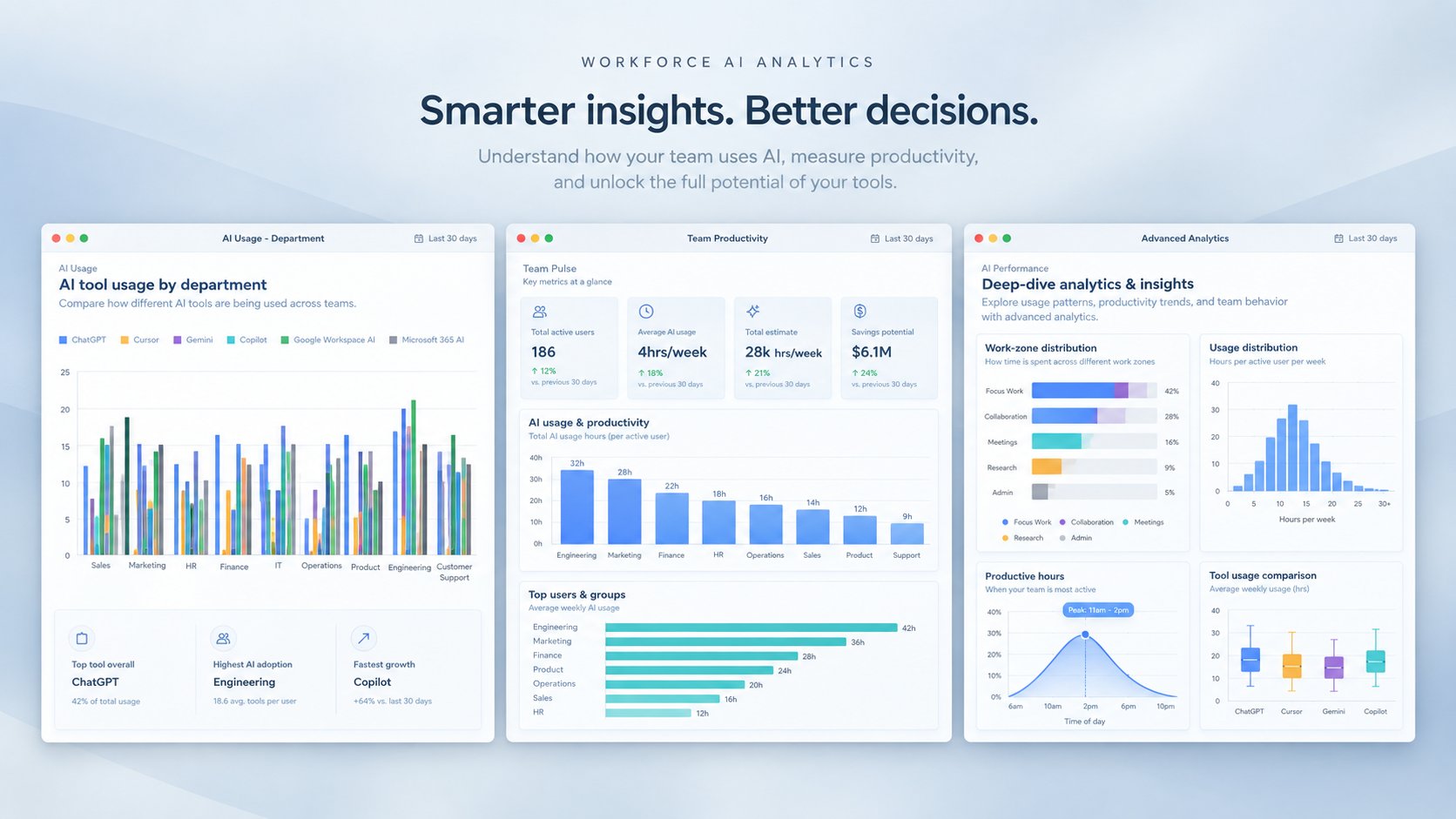
Employee productivity dashboards turn everyday work signals into a clear view of how teams spend their time. They vary widely in what they measure, how far they intrude, and how well they hold up under scrutiny. This guide sets out the criteria that separate them, compares the leading tools, and shows which situations each one fits. The right choice depends on what you need to measure and how much monitoring your people will accept.
There is no single best dashboard for everyone. The right pick comes down to three questions: how many tools you need to cover, how much you rely on screenshots or activity logging, and how strictly privacy rules apply to you. Once those are clear, the shortlist narrows fast.
As a quick guide, here is where each tool fits best:
The sections below explain the criteria behind these picks, then compare each tool in detail so you can match one to your own situation.
An employee productivity dashboard collects signals from the tools your teams already use and turns them into metrics leaders can act on. Good dashboards focus on outcomes and work patterns, such as how much uninterrupted focus time people get, how heavy their meeting load is, and how work flows across teams.
The important difference is what a dashboard measures, and how. Some tools read metadata, meaning information about work such as when a meeting happened and how long it ran, without ever looking at content. Others record the work itself through screenshots, video, and keystrokes. The first answers how work happens; the second watches what each person types, which reads as surveillance and creates legal risk.
A strong dashboard also knows what to leave off. Always on screenshots, keystroke logging, and webcam capture damage trust and, under a growing set of privacy and AI rules, invite complaints and fines. The useful signal is how work happens, not a transcript of everything a person types. It is also what separates a modern dashboard from an old style report: it updates in near real time and surfaces patterns, instead of arriving weeks later as a static summary no one acts on.
Three shifts make productivity dashboards more important in 2026.
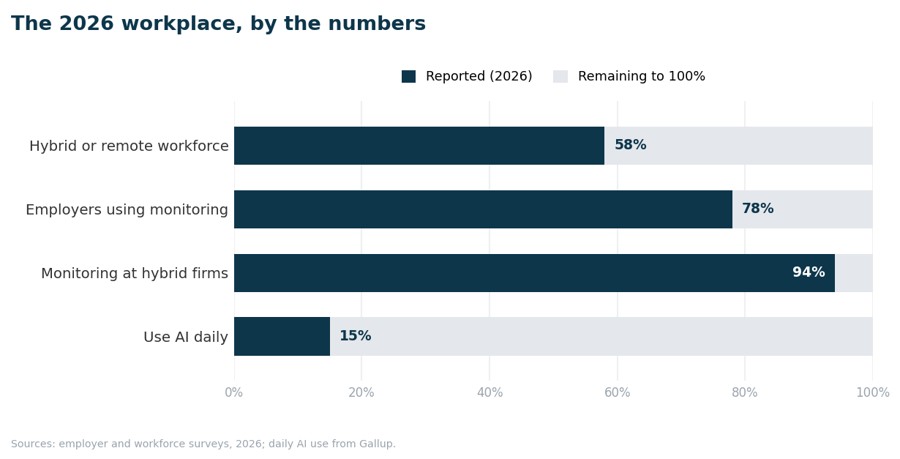
First, hybrid work is now normal, and that created a visibility gap. Most remote-capable staff work in a hybrid or fully remote pattern, so leaders can no longer read the room by walking the floor. It is little surprise that a large majority of employers, roughly 78% by recent surveys and higher still among hybrid and remote companies, now run some form of workforce measurement. The question is no longer whether to measure, but how to do it without eroding trust.
Second, AI moved from novelty to habit, and boards want proof it pays off. Daily use of generative AI at work has climbed from around 4% in 2023 to roughly 15% in 2026, and much higher in technical roles, while Microsoft 365 Copilot has passed 30 million paid seats. The returns, though, are uneven. The Microsoft 2026 Work Trend Index found 66% of AI users say it frees time for higher-value work, yet Gallup found only 12% strongly agree AI has changed how work actually gets done. That gap is a measurement problem: the organizations proving value are the ones that can see where AI is used and tie it to output.
Third, regulation raised the stakes. Enforcement against intrusive monitoring is increasing, and new rules covering software that evaluates people at work are taking effect in more places each year. How you measure productivity now carries legal weight, not only cultural weight.
Use these six criteria to judge any dashboard.
Here is how the leading dashboards compare. Pricing is taken from each vendor official page as of September 2026.

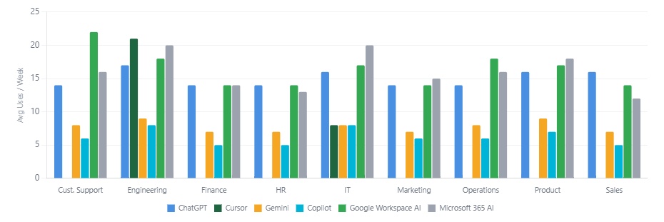
Privacy-first workplace analytics that reads signals from more than 25 tools, for leaders who want a cross-platform view without watching individuals.
Best for: cross-platform insight and AI-adoption tracking without surveillance.
Key features: 400+ metrics across Google Workspace, Microsoft 365, Slack, Zoom, Jira and GitHub · focus-time and meeting-load analysis · AI-adoption tracking by team · organizational network analysis.
Pricing: Free (up to 100 users, calendar only); Business from $2,500/month (up to 200 users); Enterprise custom, with direct access to your raw data.
Strengths: widest tool coverage · metadata only, so no screenshots or keystrokes · strong AI-adoption and manager-effectiveness reporting.
Watch-outs: no screenshots or minute-by-minute logs, so a poor fit if you specifically want those · enterprise pricing suits mid-size and larger organizations more than very small teams.
Learn more: Worklytics productivity analytics
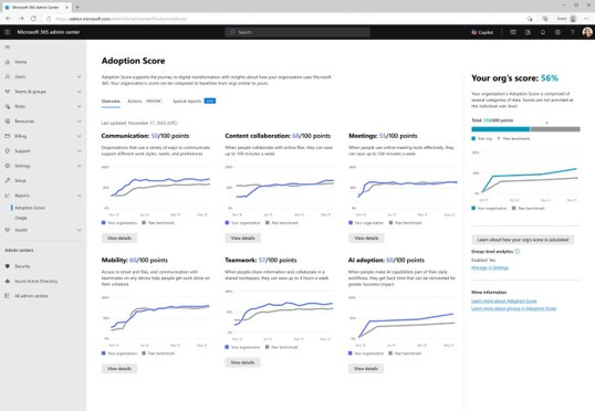
Collaboration and adoption analytics for organizations already standardized on Microsoft 365.
Best for: Microsoft-only environments.
Key features: Adoption Score at the organization level · collaboration and meeting metrics · Copilot-adoption reporting · peer benchmarking.
Pricing: Adoption Score free in the admin center; Viva Insights add-on $4/user/month, or $12/user in the full Viva suite.
Strengths: native to Microsoft 365 · free entry point via Adoption Score · strong Copilot-adoption view.
Watch-outs: sees only the Microsoft stack, missing Slack, Zoom and Google Workspace · reports at the organization level, so limited team-level depth · individual-level data was removed after a 2020 privacy backlash.
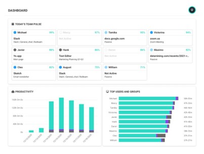
Activity monitoring with productivity dashboards, for teams that want visibility into how time is spent.
Best for: activity monitoring with optional screenshots.
Key features: real-time activity and app or website tracking · productivity classifications · team benchmarks · optional screen captures.
Pricing: Free (up to 3 users); paid tiers $10 / $15 / $17 per user/month, billed annually.
Strengths: quick to deploy · flexible reporting · a genuine free tier for small teams.
Watch-outs: screenshots cost extra (Screen Details add-on) · leans toward activity counts rather than outcomes.
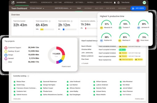
Time tracking plus productivity monitoring, with screenshots from the entry plan up.
Best for: time and attendance alongside screenshots.
Key features: automatic time tracking · screenshots and activity levels · web and app usage · payroll and attendance.
Pricing: Basic, Standard, Premium and Enterprise; annual billing includes two months free, starting around $6.70/user/month (confirm live).
Strengths: detailed time and attendance · screenshots from the base plan · payroll integrations.
Watch-outs: a screenshot-heavy approach reads as surveillance to many teams · lighter on cross-tool collaboration insight.
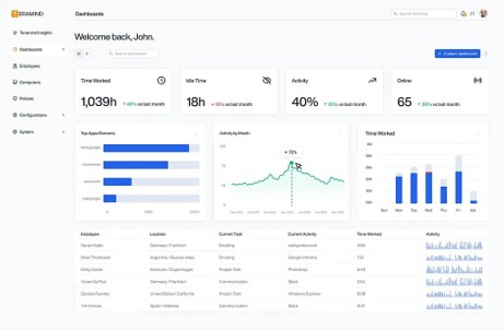
Heavy user-activity monitoring with data-loss prevention, aimed at security teams.
Best for: insider-risk and data-loss prevention.
Key features: screen recording and live view · keystroke logging from the UAM tier · behavior rules and alerts · data-loss-prevention controls · AI monitoring and governance (added 2026).
Pricing: Starter, UAM and DLP at roughly $15 / $30 / $35 per seat/month, billed annually (five-seat minimum); Enterprise custom.
Strengths: deepest monitoring and forensics · strong data-loss prevention · granular policy controls.
Watch-outs: firmly on the surveillance side, with real trust and compliance exposure · overkill if your goal is productivity insight rather than security.
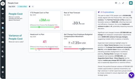
Enterprise people analytics for HR strategy, planning and attrition, rather than day-to-day activity.
Best for: long-range HR and workforce analytics.
Key features: workforce planning · attrition and retention modeling · a people-data warehouse · executive HR dashboards.
Pricing: no public pricing; custom quote only.
Strengths: powerful HR analytics and modeling · strong for strategic workforce planning · enterprise-grade.
Watch-outs: not a real-time productivity tool · no activity signal · opaque pricing and a long sales cycle.
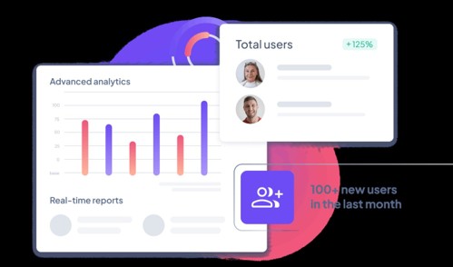
Performance and engagement software with light people analytics, aimed at smaller teams.
Best for: smaller teams focused on performance management.
Key features: goals and reviews · one-on-ones · engagement surveys · basic people analytics.
Pricing: flat about $299/month for unlimited users; Enterprise custom.
Strengths: flat, predictable pricing · performance and engagement in one place · simple to adopt.
Watch-outs: more performance management than workplace analytics · limited cross-tool activity insight.
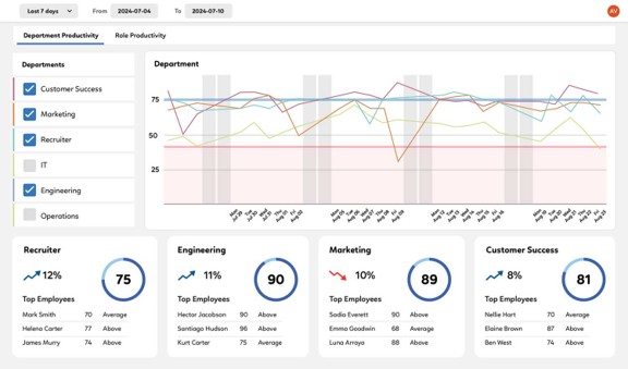
A single productivity score per person, built from activity across connected tools.
Best for: simple productivity scoring for sales and operations.
Key features: a productivity score from 1 to 100 · integrations with Microsoft 365 and Google Workspace · optional desktop agent · trend reporting.
Pricing: Basic $19.99/user/month (from $300/month, up to 15 seats); Premium and Enterprise custom.
Strengths: easy-to-grasp single score · fast setup · useful for sales and ops visibility.
Watch-outs: a single score can oversimplify real productivity · the optional desktop agent adds monitoring.
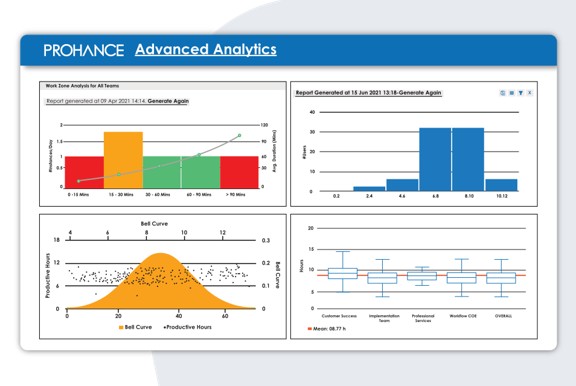
Workforce and operations analytics with utilization reporting, common in business-process operations.
Best for: operations and business-process teams.
Key features: utilization and work-output modules · 200+ reports · screen recording · operations dashboards.
Pricing: no public pricing; demo and custom quote only.
Strengths: deep operations and utilization reporting · large report library · scales to large operations teams.
Watch-outs: includes screen recording, so weigh the trust trade-off · opaque pricing · geared to operations more than knowledge-work productivity.
Sort the market by one question: does the tool record the work, or read signals about it?
The recording camp captures the work itself. ActivTrak can take screenshots, Time Doctor takes them by default, and Teramind and ProHance add screen recording, with Teramind also logging keystrokes. This is common; roughly six in ten employers now save browsing logs or watch screens. But common is not the same as safe.
The metadata camp reads signals about work, such as meeting times and message counts, without opening content. That distinction decides how hard the system is to defend. Privacy and AI rules increasingly reward data minimization, clear consent, and anonymization, all of which are simpler when you never collect content in the first place. It is also far easier to earn employee trust when there is nothing to spy on. Worklytics sits in this camp, which is why it tends to pass privacy review with less friction than screenshot-based tools.
Numbers only mean something against a reference point. A few global benchmarks from 2026 are worth holding your own data against.
Engagement is falling, and managers are the lever. Gallup, drawing on 141,000 workers across 140 countries, put global engagement at about 20% in 2025, a five-year low, with manager engagement sliding from 27% to 22%. Because teams take their cues from their manager, manager effectiveness is one of the most useful signals a dashboard can surface, and one of the most commonly missing.
AI adoption is the new baseline. With daily use near 15% overall and far higher in technical roles, tracking adoption by team shows who is pulling ahead and who needs support.
Impact comes from the system, not the individual. The Microsoft 2026 Work Trend Index attributes about 67% of AI impact to culture and managerial support, against 32% for individual skill. The lesson: point benchmarks at team patterns, meeting load, and adoption trends over quarters, not at a single headline score.
Pricing across these tools ranges from free tiers to enterprise contracts. Monitoring tools tend to charge per user per month, while a platform like Worklytics prices by plan and scales to the enterprise with direct access to your underlying data.
The harder question is return, and in 2026 most organizations still cannot prove it. In the PwC 2026 global survey of 4,454 CEOs across 95 countries, 56% saw neither higher revenue nor lower costs from AI in the past year, and only 12% saw both. The ones that do win, such as the Copilot deployments Forrester modeled at roughly nine hours saved per user each month, share one habit: they measure adoption and tie it to output. That is the whole case for a dashboard. Show which teams use AI and connect it to focus time and results, and the software spend justifies itself while training goes where it helps most, all without turning the exercise into surveillance.
See how Worklytics turns work data into insight: Worklytics productivity analytics
Different priorities point to different tools.
If your priorities are privacy, cross-platform coverage, and proving AI adoption, Worklytics is the strongest fit on this list. If your needs center on screenshots, Microsoft-only reporting, or insider-risk controls, one of the other tools here will serve you better. Match the tool to the situation rather than chasing a single winner.
A good rollout takes about three months.
In the first month, connect your core tools and agree on the handful of metrics that matter, such as focus time, meeting load, and AI adoption.
In the second month, bring managers in. Show them their team views and coach them to read patterns rather than police individuals. Involve your legal and HR teams early so consent and privacy are settled before a wider rollout.
In the third month, turn insight into action. Give managers a simple playbook: protect focus time, cut low value meetings, and support AI adoption where it lags. Review progress against your baseline rather than a single target.
What is an employee productivity dashboard?
It is a tool that collects signals from the software your teams use and turns them into metrics leaders can act on, such as focus time, meeting load, and collaboration patterns.
What are the best employee productivity dashboards in 2026?
It depends on your priorities. Worklytics fits teams that want privacy-first, cross-platform insight. Microsoft Viva Insights suits Microsoft-only shops, Time Doctor fits time and attendance with screenshots, and Teramind suits security and data loss prevention.
Which tool offers privacy-first tracking?
Worklytics. It measures metadata only, with no screenshots and no keystroke logging, which makes it straightforward to run under most privacy and data-protection laws.
Can you track productivity without screenshots or keystroke logging?
Yes. Metadata based platforms like Worklytics measure how work happens using signals such as meeting times and message counts, without capturing content or taking screenshots.
Which tools give real time productivity metrics?
Worklytics, ActivTrak, Prodoscore, and ProHance all offer real time or near real time dashboards. Worklytics does it across the widest set of tools without surveillance.
Which tools offer benchmarking?
Worklytics and Microsoft Adoption Score both support benchmarking. Worklytics benchmarks across a wider range of tools and metrics.
Where can I find secure productivity analytics platforms?
Look for platforms that measure metadata, support anonymization and consent, and hold recognized security certifications. Worklytics is built this way.
How much do employee productivity dashboards cost?
Free tiers exist. Paid monitoring tools run from about $6 to $35 per user per month. Worklytics offers a free plan, a Business plan from $2,500 per month, and custom Enterprise pricing.
How does Worklytics compare to ActivTrak and Time Doctor?
ActivTrak and Time Doctor rely on activity monitoring and screenshots. Worklytics measures metadata only across more tools, so it gives a broader view while avoiding surveillance.