The Worklytics charts in this article are illustrative examples from its AI adoption model, included to show what each measurement looks like in practice, not to stand in for audited client benchmarks. The Anthropic and NBER figures cited are independent primary sources.
Most leadership teams can tell you how much they spend on AI. Very few can tell you where those dollars turn into recovered hours. That gap is the whole problem. A seat count proves you bought access. A login proves someone was curious. Neither proves a quota-carrying rep finished her call prep faster or that an engineer shipped a feature a day sooner.
This article lays out a practical way to answer that question honestly. Measuring AI productivity is not about one adoption number. It is an efficiency map that shows where AI is actually returning time, team by team and task by task. We use the lens most executives reach for first, AI sales team effectiveness, and then apply the same method to the rest of the company. The Worklytics figures are illustrative, the external studies are not, and every layer of the map ties back to a specific measurement you can put in place.
The claim gets repeated in board decks long before anyone checks it. The reason is that three separate things keep getting collapsed into one: access, activity, and outcome. A Copilot or ChatGPT license report answers access. A weekly active-user chart answers activity. Only a link between AI use and work output answers outcome, and that link is the one almost nobody puts in place.
The distribution matters more than the average. The Anthropic Economic Index, which analyzed roughly a million real Claude conversations, found that AI use concentrates in a narrow set of task families rather than spreading evenly across all work, with coding and technical tasks alone accounting for about 37% of conversations. If real usage clusters like that, a company-wide “40% adoption” headline is close to meaningless. It averages a team saving four hours a week against a team saving four minutes, and hides the very thing a leader needs to act on. The fix is resolution: measure at the level of team and task, which is what a productivity analytics platform is built to do.
An AI efficiency map is a team-by-team, task-by-task view of where AI returns time, in place of one company-wide adoption percentage. A single number is a vanity metric. A useful map is layered, and each layer answers a different question. Worklytics organizes this as a maturity progression that moves from counting who uses AI to proving what that use is worth.
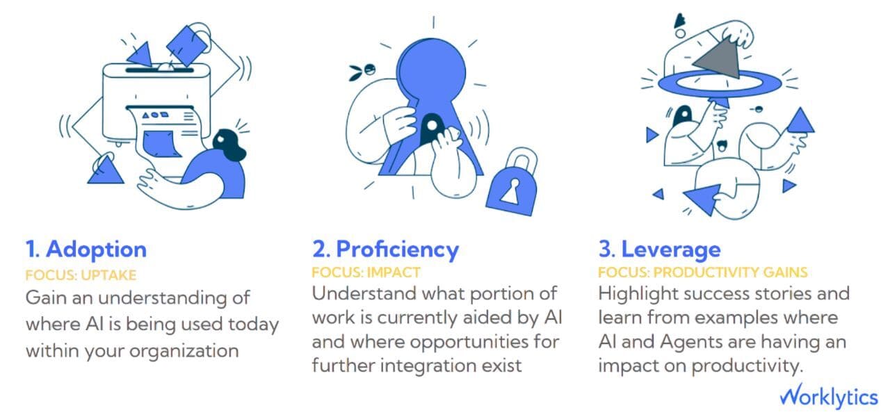
Read from the bottom up, the map has four working layers:
Each layer only makes sense on top of the one below it. Measuring productivity without knowing proficiency tells you little, because you cannot separate a power user's results from an occasional user's. The rest of this piece walks each layer with the data that lives there.
Adoption is the floor of the map, and the first surprise usually lives here. When Worklytics breaks AI use down by function, the ranking rarely matches intuition. Customer Support and Engineering tend to sit near the top. Sales, Marketing, and HR often sit at the bottom. Worklytics' published 2025 adoption benchmarks by department put real ranges on each function, so you can compare your own floor against them.
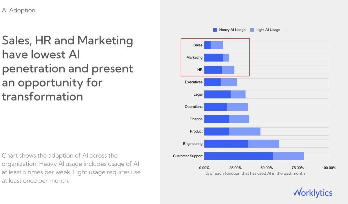
That ordering carries a direct message for revenue leaders. Sales sits closest to the money yet often shows the smallest AI footprint, which flips the assumption that customer-facing teams adopt fastest. It also means the single largest lever on AI sales team effectiveness is not squeezing more from current users. The baseline is low, so it has room to move. A team in the low double digits has far more upside than one already past two-thirds.
You can only act on that if the adoption view is trustworthy and current. Worklytics builds this layer by connecting usage metadata (records of how often each tool is used, never the content of messages) from the AI tools already in your stack, including ChatGPT, Claude, Microsoft Copilot, Google Gemini, Slack, and Zoom, into one AI adoption dashboard instead of a stack of separate exports from each tool. Because it reads real usage rather than self-reported surveys, the map reflects what people do, not what they say in a training follow-up.
Adoption is a yes or no. Proficiency, meaning how well, and how often, someone uses a tool, is a spectrum, and that distinction is where most dashboards quietly mislead. A rep who pastes one prompt a month and a rep who runs two dozen AI actions a week both register as “active.” Treating them as equal guarantees you will misread the productivity layer above.
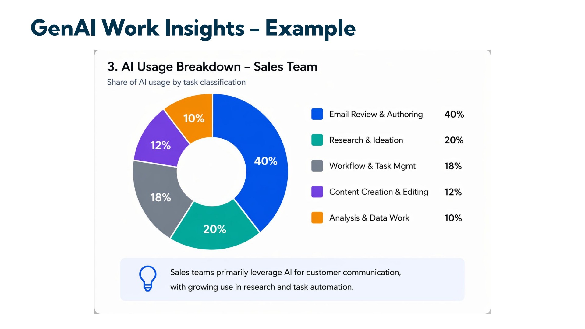
Worklytics separates them on two axes. The first is intensity, which sorts users into heavy, light, and occasional tiers so the map can weight results by how much someone actually relies on the tool. The second is task type. A raw prompt log is unreadable at scale, so Worklytics sorts each AI event into a work category using the prompt text, nearby activity, and usage records.
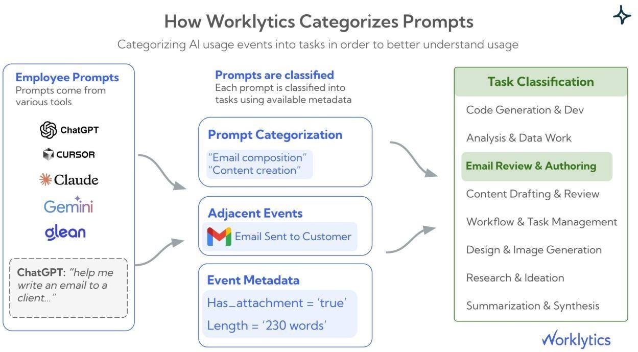
This layer earns its place through inference, not decoration. Once you know that a sales team's AI activity is mostly email drafting and very little research, you can predict its productivity ceiling before you measure output, because drafting returns less time than analysis or preparation. Task-level proficiency is what turns a flat usage number into a diagnosis. Worklytics documents the method in its guide to measuring prompt usage in AI adoption programs, and the same engagement measurement extends beyond AI to how teams collaborate, focus, and communicate.
This is the layer executives actually want, and it is where the sales lens pays off. The pattern in Worklytics data is consistent: AI does not lift every activity equally. It compounds where it removes preparation and drafting friction ahead of a human conversation, which is exactly the shape of front-line sales work.
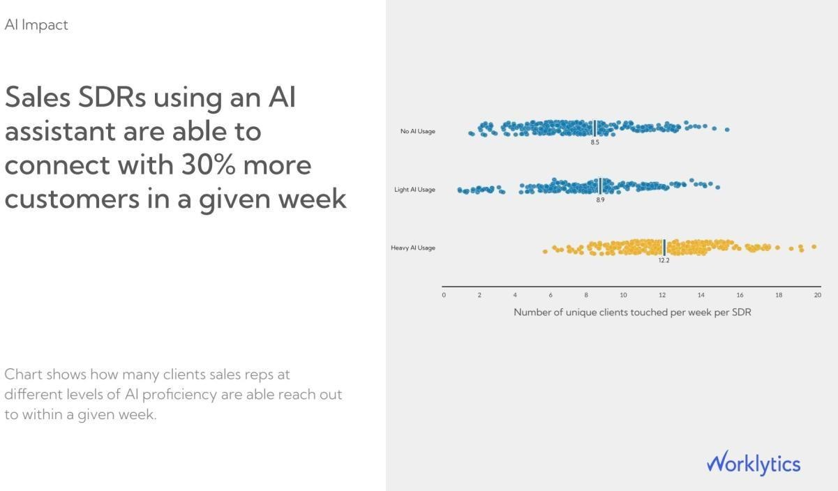
Start with outreach volume. In a representative benchmark, sales development reps who use AI heavily contact about 12.2 unique clients in a week, against 8.5 for reps who use no AI, roughly 30% more accounts reached.
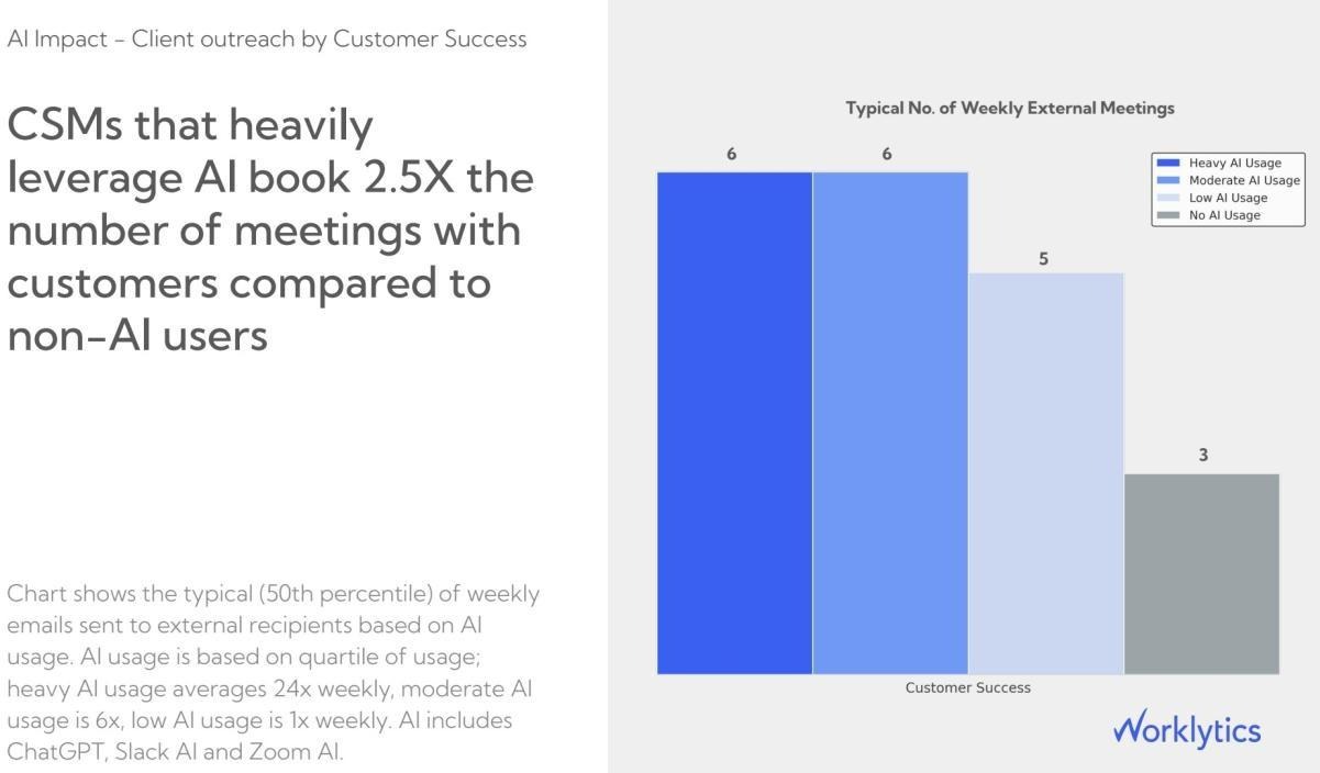
The same shape holds in Customer Success. Reps who use AI heavily book about double the external customer meetings of peers who use none, roughly six a week versus three. The mechanism is not magic. AI absorbs the account research, recap drafting, and follow-up writing that used to sit between meetings, so more of the week is spent in front of customers instead of preparing to be.
The pattern extends past sales. In another representative benchmark, customer support reps who use AI heavily resolve about 80% more tickets a week, 10.5 versus 6, with the largest gins among newer staff. That skew is not unique to Worklytics. The peer-reviewed Generative AI at Work study found a 14% average productivity gain among support agents, rising to 34% for the least experienced. The through-line for revenue teams is the same. AI sales team effectiveness improves most where the tool clears the research, drafting, and preparation that sit in front of a customer conversation, and the reps who gain most are the ones still building their instincts.
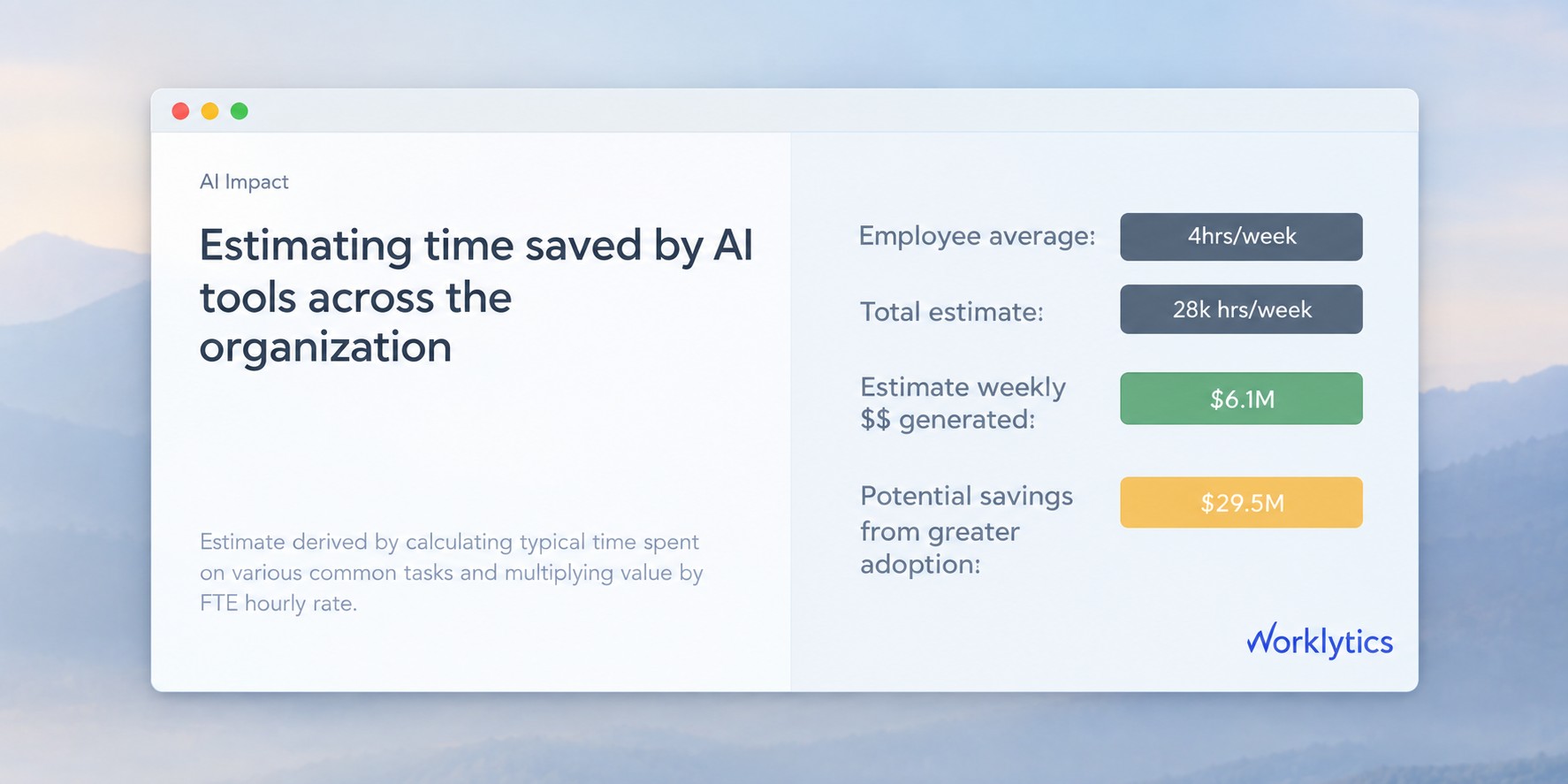
Productivity gains are only real if you can price them. The top layer of the map turns task-level time savings into a financial figure with a simple, defensible method: estimate the typical time each task takes, multiply the hours saved by a fully-loaded hourly rate, and add it up.
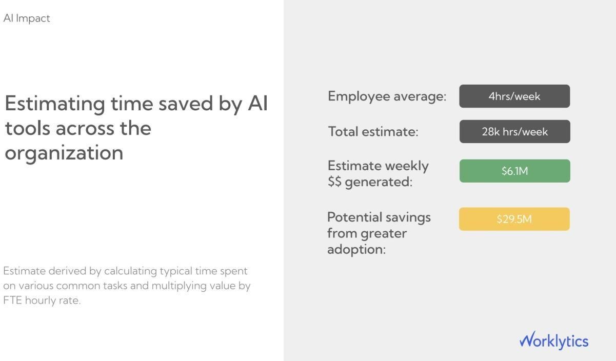
The figure that should change a leader's behavior is the last one. The gap between value captured today and value available at fuller adoption reframes the conversation. The question stops being “is AI working” and becomes “how much return is stranded in the teams that have not adopted yet.” That is a management problem with a named owner, not a licensing question for procurement.
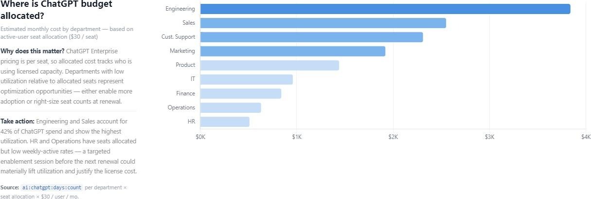
Impact is only honest when you also account for spend, which is why AI cost tracking belongs in this layer. Worklytics can export usage data into your data warehouse or reporting tool, where it joins each AI tool's billing exports so spend can be attributed to the team that generated it. Read that way, a team's productivity gain sits right next to what it costs to produce.
Once the map exists, the next question is how to shift the low-adoption teams. The data gives a clear, slightly uncomfortable answer: adoption travels downhill from managers. In a representative sample, teams whose manager is a heavy AI user adopt AI at 37%, nearly double the 20.5% on teams led by a manager who rarely uses it.
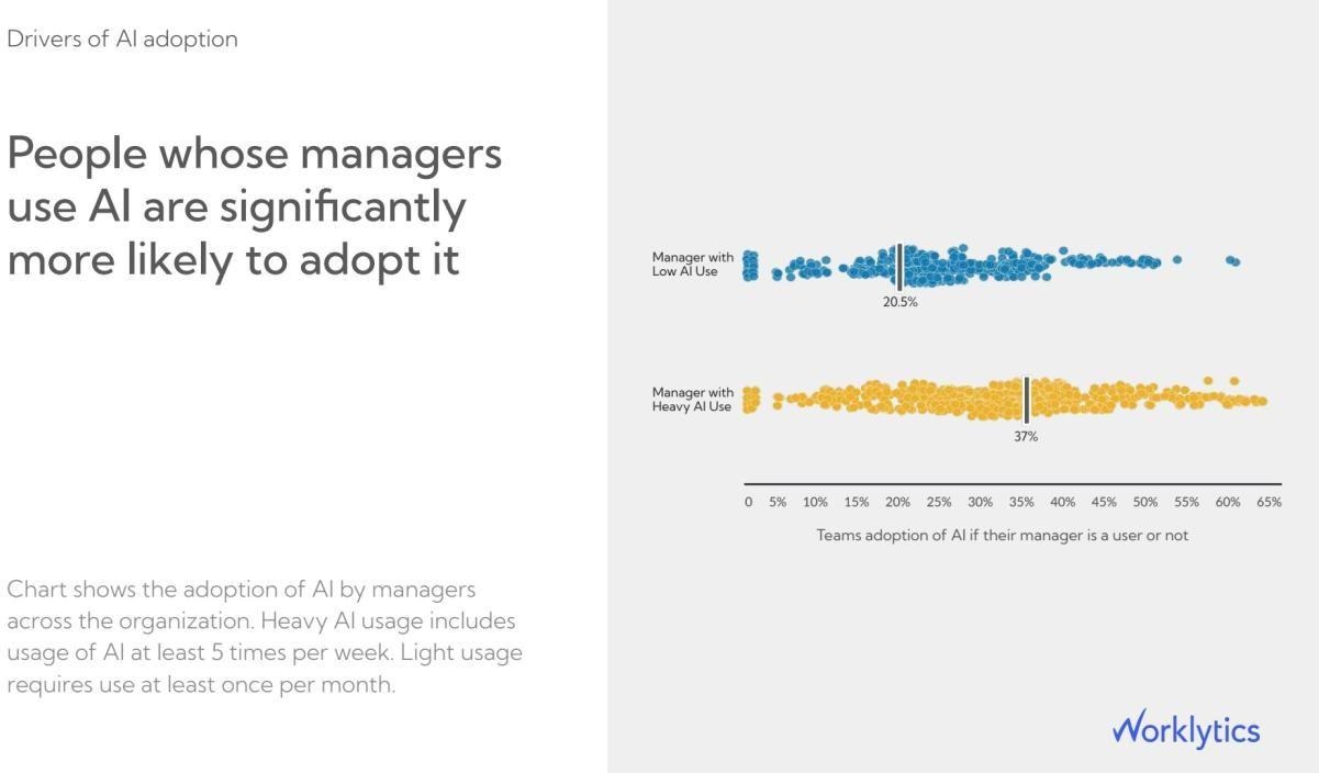
The practical takeaway is that a company-wide enablement email is the weakest lever available, and manager behavior is the strongest. To raise AI sales team effectiveness, the fastest path is not another all-hands demo. It is getting sales managers to use AI in their own workflow, because their teams follow. Worklytics built a measure for exactly this, the AI Adoption Facilitation Index, which isolates a manager's
influence on team usage. For why the dynamic exists, see Worklytics on leadership's role in AI adoption, and for the numbers to put on a review, the manager AI adoption KPIs. The same platform measures manager effectiveness more broadly, from how often managers hold one-on-ones to how much focus time their teams keep.
None of this works if employees experience it as surveillance, so how the map is built matters as much as what it shows. Worklytics runs on usage records, how often tools are used and by which team, rather than the content of prompts, messages, or documents. A privacy step removes individual identities before analysis, which keeps the map at the team and group level where decisions are actually made.
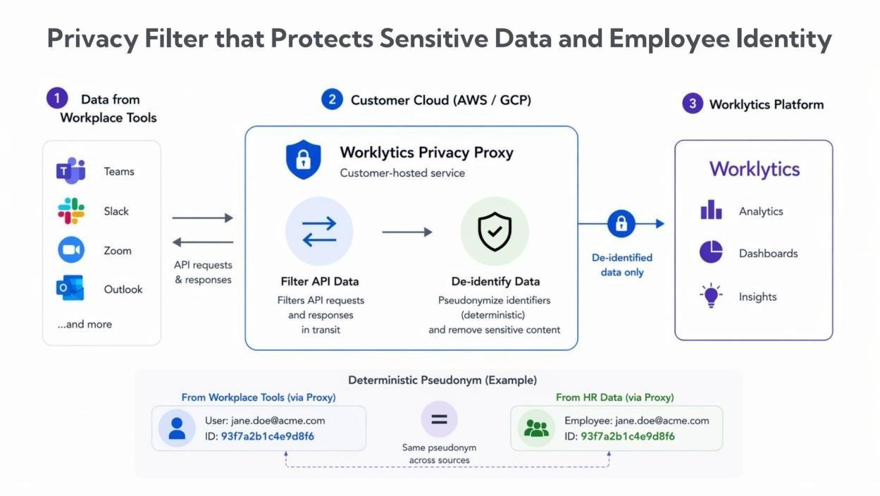
This is the difference between workplace measurement that leaders can defend and monitoring that erodes the trust it depends on. Aggregate, de-identified records give you the resolution to find stranded value without turning the tool into a reason for people to hide their work.
The four layers are the plan. In practice, the sequence is straightforward:
Because the same Worklytics platform already measures employee productivity, engagement, employee well-being, meeting effectiveness, and manager effectiveness, the AI efficiency map does not sit in a silo. It plugs into the fuller picture of how work happens, which is what keeps AI investment accountable quarter after quarter.
An AI efficiency map is a team-by-team, task-by-task view of where AI returns time inside a company, in place of a single adoption percentage. It layers four measurements: who uses AI (adoption), how deeply and on what tasks (proficiency), whether output improves (productivity), and what the recovered time is worth (impact). Worklytics builds this view from records of AI tool usage.
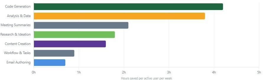
Time savings concentrate in a few task types. In Worklytics' illustrative model, active users recover about 4.2 hours a week on code generation, 3.8 hours on data analysis, and about 2.1 hours on meeting summaries, while email drafting returns under 1 hour. The savings are real but uneven, which is why measuring at the task level matters more than a company-wide average.
You connect AI usage to sales output at the rep level: unique clients contacted, customer meetings booked, preparation time protected, and deals advanced. In Worklytics' illustrative benchmarks, heavy-AI sales development reps reach about 30% more clients a week, and heavy-AI Customer Success reps book about double the customer meetings of peers who use no AI.
Yes, with the largest gains among newer staff. In Worklytics' illustrative benchmarks, heavy-AI sales development reps reach about 30% more clients a week and Customer Success reps book about double the meetings. The peer-reviewed Generative AI at Work study found a matching pattern for support agents: a 14% average productivity gain, rising to 34% for the least experienced workers.
Worklytics analyzes usage records, meaning how often each tool is used and by which team, not the content of prompts, messages, or files. A de-identification step removes individual identities before analysis, so results stay at the team and group level. This keeps AI usage tracking accurate while protecting employee privacy.
Combine each AI tool's own billing and admin usage exports with records of who used what, then attribute spend to the team that generated it. Worklytics supports this by exporting usage data into your data warehouse or reporting tool, where it can be joined with billing data so AI cost and AI value sit side by side.
It varies by function and industry. In Worklytics data, Customer Support and Engineering usually lead while Sales, Marketing, and HR trail, which tends to signal opportunity rather than failure. Worklytics' published 2025 benchmarks by department and industry give a reference range for each function.
Most companies see their first AI adoption metrics within a week of connecting their tools, with meaningful trend data building over the following 30 days. Productivity and ROI layers follow once usage is connected to output for revenue-facing teams.
Ready to see where AI is saving time in your organization? Explore Worklytics to map AI adoption, engagement, productivity, and impact from the tools you already use.