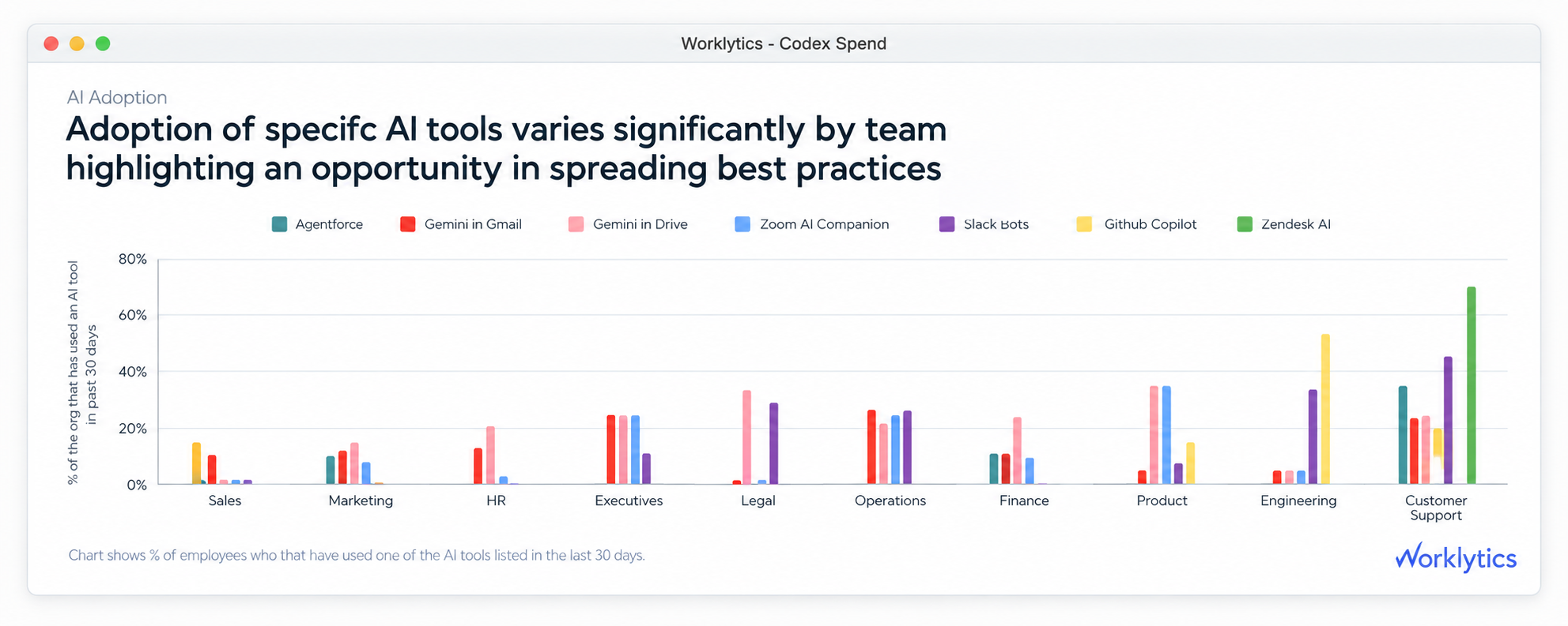
A consolidated AI dashboard is one report that pulls usage, cost, and results from every AI tool a company runs, and puts those numbers in the same terms so you can compare them, add them up, and rank them. It sits on top of the reports each AI tool already gives you, rather than replacing them.
The difference that matters is between collecting and comparing. Downloading four spreadsheets into one folder is collecting. A consolidated AI dashboard only becomes useful once the same employee, the same time period, and the same definition of a use apply across all four tools. Everything below is about that second step, because it is where most in-house attempts get stuck.
Anthropic, OpenAI, Microsoft, and Google all give admins a usage report, a filter for looking at specific teams, and a way to download the data. The problem is not that the reports are missing. The problem is that their numbers cannot be compared.
Each report was built around how that company charges you, and that decided what gets counted. Anthropic charges for how much you use, so Claude reports requests, tokens (the units of text an AI model processes), and dollars spent. OpenAI charges per person, so ChatGPT reports messages and how many people have started using it. Microsoft charges per person per app, so Copilot reports how many people used it inside Word, Outlook, Teams, and the rest. Google limits how much AI each subscription tier allows, so Gemini reports feature use and how close people are to their limit.
So when an executive asks what the company AI adoption rate is, they get four answers that cannot be averaged, added, or ranked. A department at 70% on Copilot and 20% on Claude is not 45% adopted. Those two numbers describe different sets of people, over different time periods, counting different things.
The table below compares the four reports on the points that decide whether their numbers can be combined. Every value comes from the official documentation each company publishes for admins.
Three things in that table create most of the cleanup work. First, Copilot and ChatGPT report on a list of specific employees that IT already manages, while Claude reports on how much was spent, which finance manages. Second, the reports update at different speeds, so a Monday morning snapshot of all four covers four different stretches of time. Third, the team labels come from different staff directories, so Engineering in Microsoft, Engineering in ChatGPT, and Engineering in Google Workspace often contain different people. For step-by-step guides on each tool, see tracking Claude Enterprise usage, exporting ChatGPT Enterprise usage data, and tracking Copilot use.
Combining these reports is not just a matter of moving data around. Pulling four sets of data into one place gives you four disconnected tables. The work that makes a consolidated AI dashboard usable happens after the data arrives, and it runs in this order.
One engineer can have a Claude seat under a work email, a GitHub Copilot licence under a GitHub username, a Gemini licence under a Google Workspace team, and a ChatGPT seat created automatically by your staff directory. Until those four records point to the same employee, you cannot work out what AI costs per person or who is actually using it. Worklytics matches accounts against your HR system, which also brings in department, tenure, level, and who each person reports to.
Each AI tool measures against whichever group it charges you for. To get a number you can compare, pick one group, usually everyone in a department, and measure every tool against it. This changes the answer a lot. A tool used by 80% of its 60 licence holders reaches 12% of a 400-person department. Only the second number is useful when deciding what to renew.
Copilot reports the last 28 days by default. Claude spend runs a day behind. Gemini takes up to 72 hours to reflect team changes. Adding everything up weekly, on a fixed day, smooths those differences out. Reporting faster than that means the slowest tool quietly sets how current your whole dashboard really is.
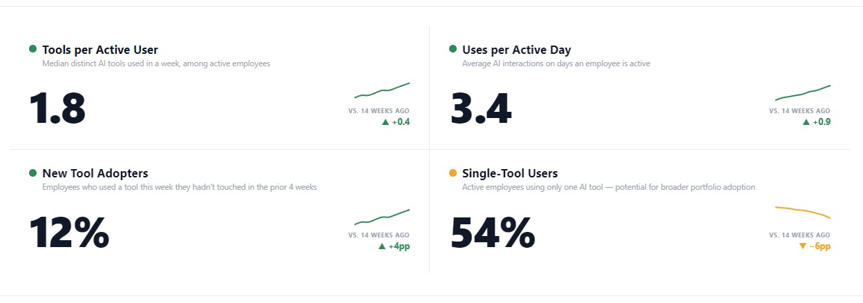
Messages, requests, and feature uses are not the same thing, so you cannot add them together. Two measures do work across all four tools: how many days a week someone uses AI, and how many times they use it on the days they do. Days per week shows whether it has become a habit. Uses per active day shows how deeply they rely on it. Together they separate someone who opened a tool once from someone who works inside it, without depending on how any one tool defines an event.
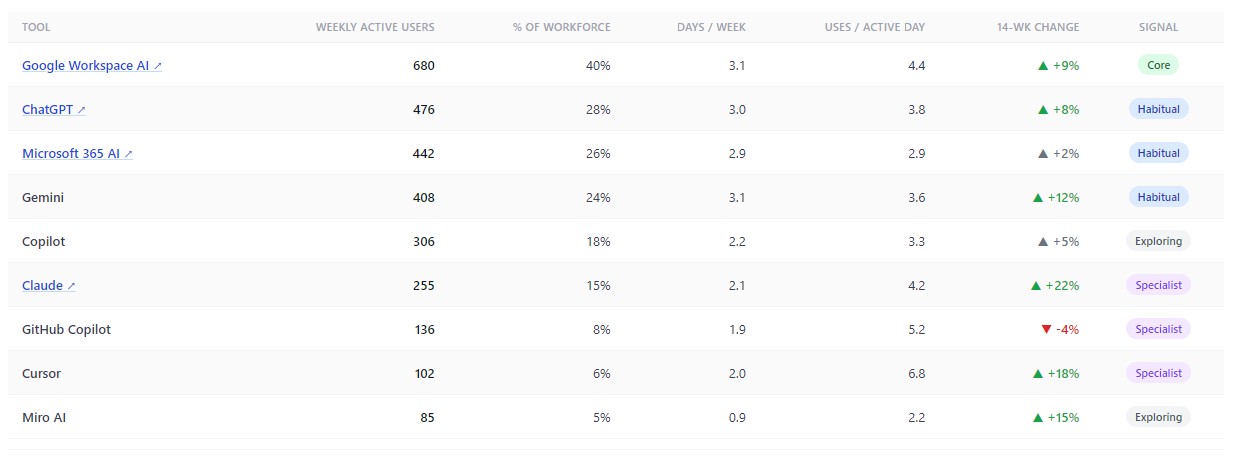
How each measure is calculated is published in the Worklytics Data Dictionary, so your analysts can check where a number came from instead of trusting the label. Teams who want the combined data inside their own reporting tools can send it through DataStream and join it to the HR and delivery data they already hold.
Counting who logged in is a licensing number. It tells you someone signed in once. Depth tells you whether the tool changed how they work, and depth is what predicts whether the licence is worth renewing.
Plotting days per week against uses per active day sorts every tool and every team into four groups, each needing a different response:
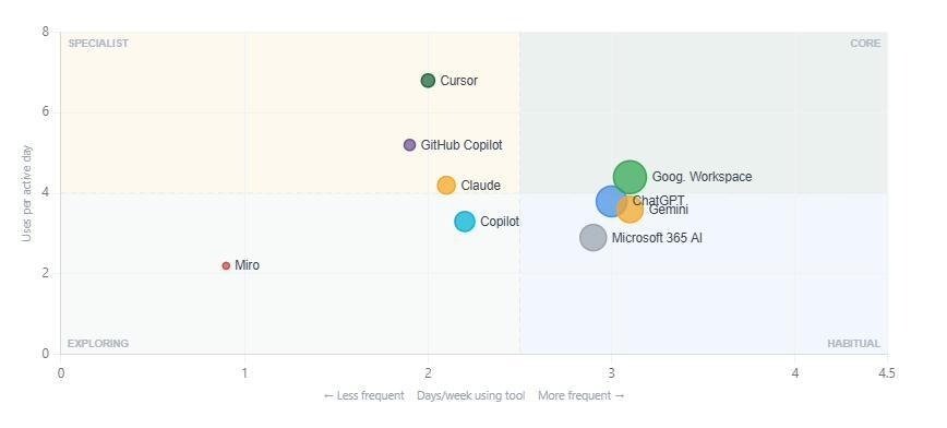
Sample report: tools sorted by how often and how deeply they are used, which separates a wasted licence from one that is simply specialized.
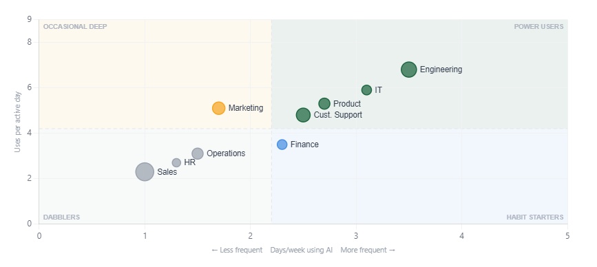
The same chart applied to departments instead of tools shows where training effort pays off most. A department using AI on few days but going deep each time already knows how to use it and just needs the habit. A department using it most days but only briefly has both a habit and a technique gap, and that responds better to prompt examples from colleagues than to training from the AI company.
Looking across all tools at once answers a question no single tool can. The average number of AI tools each active person uses shows whether employees are settling on one main assistant or spreading thin across several that overlap. A high share of people using only one tool means the rest of what you pay for is sitting unused.
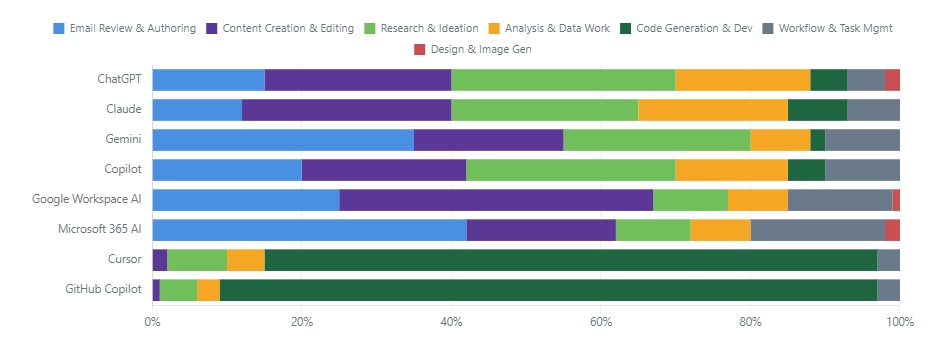
How much a tool is used does not tell you what it is worth. A thousand messages a week spent rewriting emails and a thousand spent generating code return very different value and justify very different budgets.
Worklytics sorts AI activity into types of work: coding, research, analysis, summarizing, drafting, and writing emails. It does this from records of what happened, not from reading what people typed. The same set of categories is applied to Claude, Copilot, Gemini, and ChatGPT at once. That gives you a breakdown of what each tool is used for, which shows overlap straight away. Two tools doing near-identical work in the same department are competing for the same job, and one of them is a candidate for cancellation. The tools Worklytics connects to are listed on the integrations page.
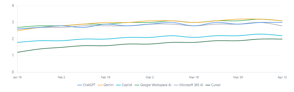
Steadiness is the second signal worth watching. A tool used in bursts behaves differently from one used at a steady weekly rhythm, even when the totals match. Bursts rarely change how people work, so they rarely change results.
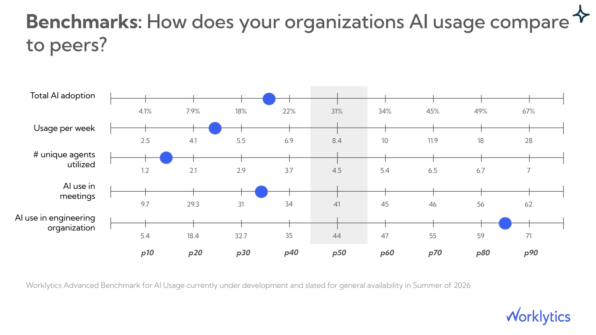
An internal number is hard to read on its own. A 22% adoption rate is poor if similar companies sit at 45% and strong if they sit at 8%. ChatGPT includes a comparison against an industry average for a few of its own measures, which is useful as far as it goes and covers only that one tool.
Worklytics Benchmark compares overall AI adoption, weekly usage, how many different AI agents are in use, AI use in meetings, and adoption by department against similar companies, across every tool rather than one. Seeing where you rank matters more than seeing an average. A company sitting in the bottom half on overall adoption but the top fifth on sales-team AI use does not have a company-wide problem. It has some teams far ahead and others far behind, and those two situations need different budgets.
Most companies now pay for AI in three different ways at once. Anthropic charges for how much you use and gives you a daily breakdown of spend per person and per model. OpenAI charges per person. Microsoft mixes a per-person licence with credits you spend as you go. Google limits AI use by which subscription tier you bought.
To combine those, you convert each one to the same figure: cost per active user per month, charged back to the department that ran it up. That single step answers three questions no individual tool report can.
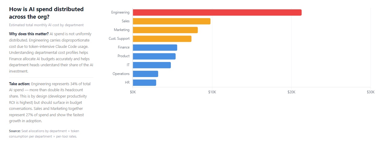
Engineering usually costs the most, because coding assistants run constantly and consume a lot. That on its own is not a problem. The case worth acting on is a tool with many paid licences and few weekly users, where you can recover the difference at renewal without affecting anyone who is actually using it.
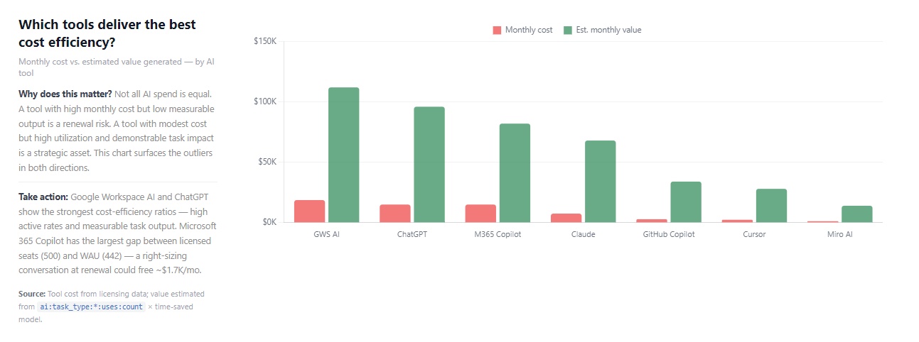
Estimates like these rest on assumptions, and those assumptions should be visible rather than hidden. Worklytics shows the inputs behind its time-saved figures so your finance team can swap in its own salary costs. The AI ROI calculator runs the same sums against your own headcount and licence costs before you commit to anything.
ChatGPT measures its effect on a company through optional surveys inside the product, and OpenAI states plainly that these are rough indicators and do not prove AI caused any gain. Claude reports an estimated time saved, worked out from activity it can see. Both are reasonable within their own limits, and neither can see work that happens outside their own product.
Measuring behavior covers the rest. Worklytics tracks three stages that turn a usage report into a real measurement: adoption (who is using AI), proficiency (how much of the work is AI-assisted), and leverage (whether people are getting more done in a day). The full method is on the AI adoption dashboard page.

The Worklytics measurement model: adoption, proficiency, and leverage, each answering a different question.
Time-saved figures are only believable when tied to specific kinds of work rather than claimed for the whole company. Code generation and data analysis consistently save the most per person, because both replace long stretches of work rather than single steps. Writing emails saves the least, because the task was short to begin with.
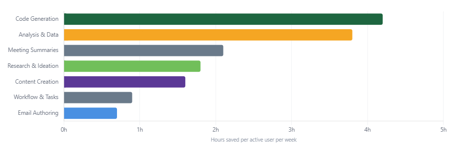
The other half of the picture is what has not happened yet. Measuring which repetitive work is still being done without AI puts the remaining opportunity in the same units as the value you have already captured. That is what lets you compare a case for more training against a case for more licences.

Bringing four tools together makes the resulting data more sensitive than any one of them on its own, so the rules around it have to be stricter than any single tool requires.
How this is built, and the layer that enforces it, is documented on the Worklytics privacy page. This matters commercially as well as ethically. Employee representative groups in several European countries have grounds to challenge AI monitoring where a company cannot show that content is left behind at the point of collection, rather than filtered out later in the report.
Connecting the tools usually produces first numbers within a week. Reading a trend takes about 30 days, because week-to-week swings in AI use are big enough to mislead before then.

What is a consolidated AI dashboard?
One report that combines usage, cost, and results from every AI tool a company runs, and puts those numbers in the same terms so they can be compared and added up. It is different from the report inside each AI tool, which covers only that product in its own units, and different from a software spend tracker, which standardizes cost but not how deeply a tool is used.
Can I build a consolidated AI dashboard myself?
The data is available from all four tools. Claude offers an automatic data feed on Enterprise plans. ChatGPT lets admins download spreadsheets on request, with a separate feed for detailed records and another one covering only its coding product. Microsoft makes Copilot usage available through its developer tools. Gemini exports from the Google Admin console. The hard part is not getting the data out. It is matching accounts across four staff directories, agreeing one comparison group, lining up the time periods, and keeping it all working as each company changes what it reports.
How often do these reports change?
Often enough that a home-built version needs someone looking after it. In the first half of 2026 alone, Google added new Gemini usage and limit reports to the Admin console, Microsoft cut its Copilot refresh time to 48 hours, moved its default view from 30 days to 28, and split AI agent figures into a separate report, and Anthropic added cost breakdowns by team and by person to Claude. Anything you build in-house has to be updated each time.
What is the difference between a consolidated AI dashboard and a software spend tracker?
A spend tracker standardizes cost and licence data. It tells you what you pay and how many licences sit unused. A consolidated AI dashboard also tells you how deeply the tools are used, for what kind of work, and whether output changed. The two overlap on unused licences and part ways everywhere else. A renewal decision usually needs both.
Does a consolidated AI dashboard read employee prompts?
A privacy-first one does not. Worklytics analyzes records of activity: how often, when, which tool, and what type of work it looks like based on surrounding signals. What people typed and what the AI replied are never collected. Any provider that needs to read prompts in order to categorize usage carries a very different set of privacy obligations, and that is worth confirming before you buy.
How many AI tools does a company usually need to combine?
More than the finance list suggests. Once you count coding assistants, meeting notetakers, and the AI features built into Microsoft 365 and Google Workspace licences, the number of places AI is actually being used is normally higher than the number of AI contracts signed, because some arrived inside licences bought for other reasons. Work the number out from usage data, not from the contract list.
Which single measure best shows AI adoption is working?
Uses per active day, tracked over time and split by department. Weekly active users tells you people turned up. Uses per active day tells you the tool became part of the work. Rising user numbers with flat depth means the rollout reached people without changing how they work, which is the most common way AI programs quietly fail.
Can we export the data to our own systems?
Yes. Worklytics DataStream sends the combined AI usage data to your own data warehouse or reporting tool, so you can join it to the HR, finance, and delivery data you already hold.
Anthropic, OpenAI, Microsoft, and Google will keep improving their admin reports, and each will keep measuring its own product in its own units, because that is what their pricing requires. None of them is in a position to compare your whole set of AI tools against each other.
That has to sit above them, joined to the staff and work data you already own. Worklytics builds it from data your company already holds, covering AI adoption, engagement, productivity, and results, so the answer to how your AI investment is doing is one number you can explain, rather than four that cannot be added together.