Learn how Worklytics can boost AI adoption in your organization

Learn more

Worklytics Product Updates - March 2026

Hello!

This month’s updates are all about helping you better understand how work is actually happening across your organization, especially as AI adoption accelerates.

We’ve added new data connectors, launched a dashboard to compare how AI is changing work patterns, and introduced new ways to visualize where time is really going during the day. You’ll also find a step-by-step demo to help you turn business questions into clear answers inside the platform.

  • New AI data connectors → Claude, Claude Code, and GitLab now live, plus Gong AI coming soon
  • New 'Getting Insight' demo → A step-by-step tutorial showing how to answer business questions using the dashboard
  • New AI Usage & Work Patterns Dashboard → See how heavy vs. low AI users differ in focus time, collaboration, and more
  • New Focus Time Shape of Day chart → A dynamic, data-driven view of how your employees' workday is actually structured, and what's cutting into deep work

Scroll on for details

Connecting More AI Tools to Deepen Work Insights

New Data Connectors: Claude, Claude Code & GitLab

We've added three new data connectors — Claude, Claude Code, and GitLab. Expanding the ways you can bring work activity data into Worklytics and understand how your teams actually operate.

Coming soon: We're also adding a Gong AI connector, giving revenue teams a way to connect conversation intelligence data to broader work patterns.

You can always find the latest list of all integrations and connections Worklytics has here.

Learn How to Answer Business Questions in the Dashboard

New 'Getting Insight' Demo Video

Not sure where to start when you open the dashboard? Our new 'Getting Insight' tutorial video walks you through how to take a real business question and find the answer using Worklytics — step by step.

This is a great resource for:

  • New users getting oriented in the dashboard for the first time
  • Existing users looking to get more out of the data they already have
  • Managers and leaders who want to frame their own questions and explore independently

Check out the demo here →

Understand How AI Usage Shapes Work Patterns

New AI Usage & Work Patterns Dashboard

As AI tool adoption grows, teams are naturally asking: does using AI actually change how people work? Our new AI Usage & Work Patterns Dashboard helps you find out.

This dashboard lets you compare work behaviors across teams with high vs. low AI tool usage, giving you a clearer picture of what's actually shifting.

You can now explore questions like:

  • Do heavy AI users have more uninterrupted focus time?
  • Are high-AI-usage teams collaborating differently — fewer meetings, more async?
  • Which employee segments are adopting AI tools fastest, and how is that reflected in their work patterns?

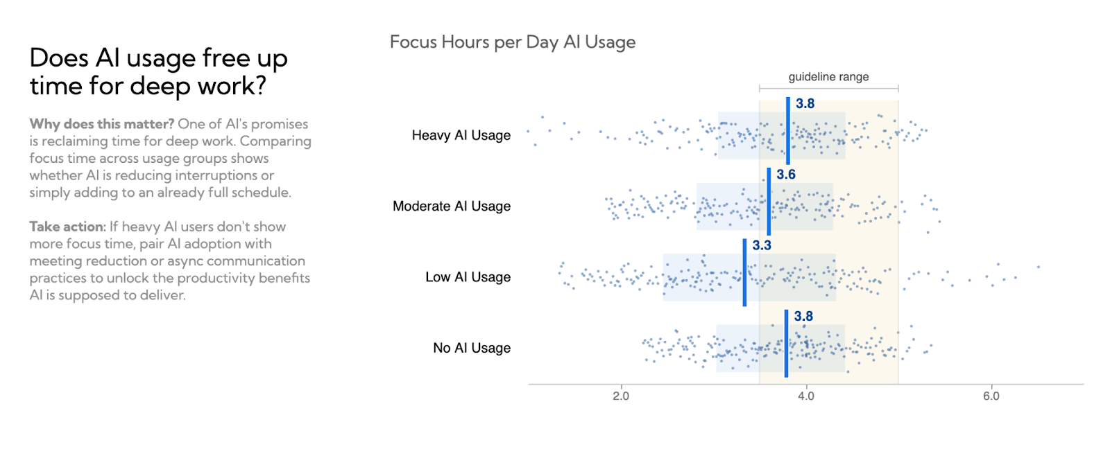
This dashboard is now available to customers with AI data connectors live.

See How Your Workday Is Really Structured

New Focus Time Shape of Day Chart

Most teams have a sense that the workday feels fragmented — but now you can actually see it. We've added a new interactive chart to the Focus Time dashboard that shows a dynamic, data-driven view of what a typical employee's day looks like at your organization, built from your real data.
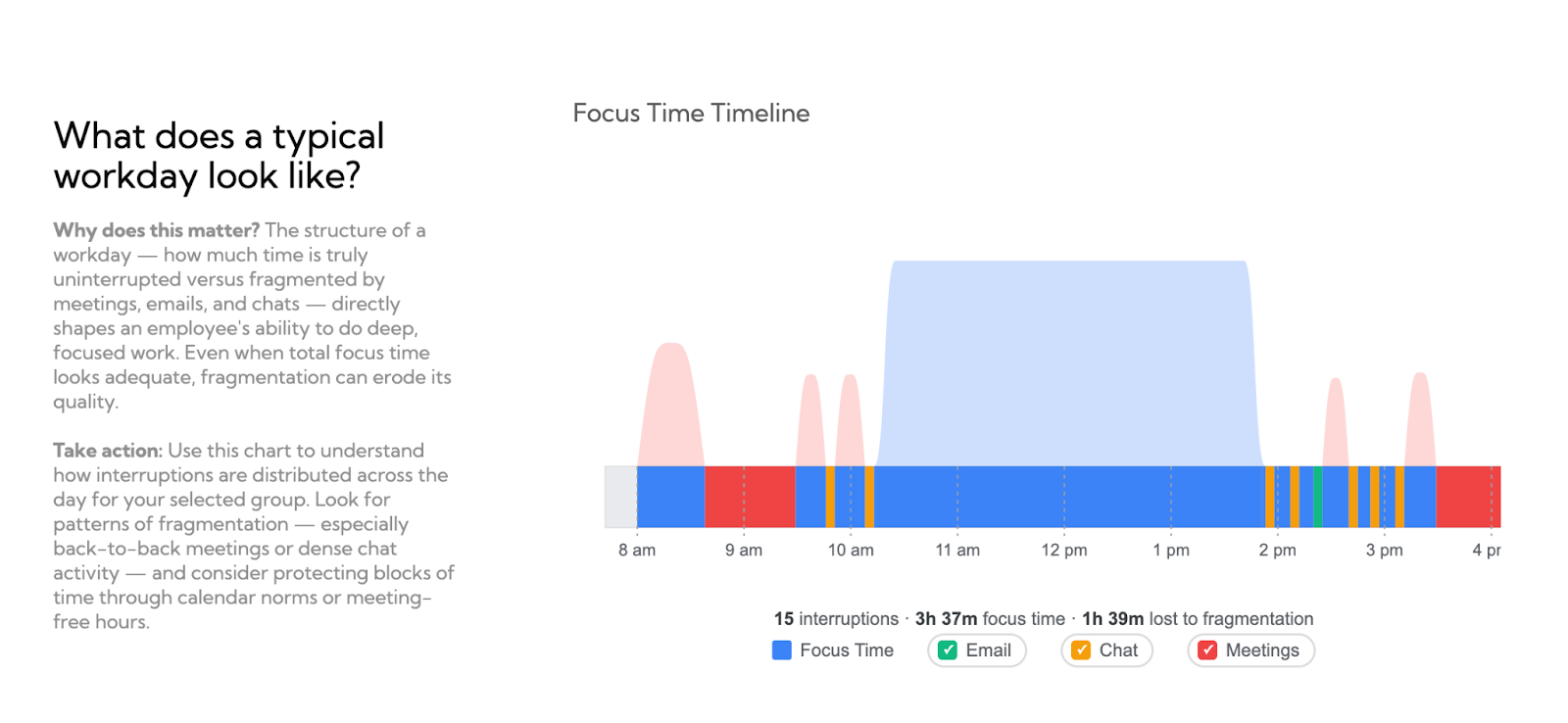
You can now:

  • Toggle activities on and off — instantly see how reducing meetings, email, or chat would expand available focus time
  • Visualize fragmentation patterns — understand where interruptions are most concentrated across the day
  • Make the case for change — with a concrete, data-backed picture of how your organization's workday is really structured

Request a demo

Schedule a demo with our team to learn how Worklytics can help your organization.

Book a Demo